Tuesday, 1 July 2014

Stencil It at Country View Crafts

Sue C is asking us to use stencils for our new challenge this month and rather than make a project I thought I would show a technique that you can use for many different things.
We often see the word ‘masterboard’ being used but what does it mean? there are lots of interpretations over the internet but for me it is to make a large piece of art that can then be cut up and used for other smaller projects. So I have been having fun making masterboards that I will use for front and back covers of journals and notebooks.
mixed media stencil
This is one of the masterboards I have made for journal covers and here is another and the process steps for making it using PaperArtsy Fresco Finish paints and Grungepaste, Distress Stains and a Tim Holtz stencil.
mixed media stencil masterboard
Cut your card/greyboard to size and cover with paint. I used Fresco Finish Toad Hall which is opaque and covers really well. I like to keep this layer dark so that it shows through the stencilling later.
P1170344
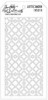
Next add your stencil layer, here I used Grungepaste and the Tim Holtz Latticework stencil, using a palette knife to spread the paste but an old credit card would do too.
P1170345
I applied random bits over the board and washed my stencil and palette knife straight away so the paste didn’t gunge up any of the stencil and prevent it from working properly next time I want to use it.
P1170346
I then chose some lighter opaque colours and applied them with foam, when they were dry I then applied some translucent colours to change the colouring of the base I was working on.
P1170347
P1170348
At this point I decided I wanted some extra colour on the stencilled parts so I used my finger and a little water to blend colours in random places finishing with some Snowflake to highlight some of the areas.
P1170352
Next came the fun part and be warned this does take a little time and you have to decide along the way when enough is enough (I find that soooooo hard to do).
P1170355P1170356
Splat some DS at the top, along the side or even in the middle of your board, mist it with water and then lift and angle it to watch it run. See it meander through the cracks of the stencilled areas and pop out the other side, mist it again if necessary and then heat dry. Do this repeatedly with other colours and in different places until you have achieved your desired look and remember to dry between each colour you add.
P1170357
Hep presto your artsy masterboard which can now become a background for your journal cover. I really love the effects you can achieve with different colours and stencils. In fact I taught this as a class last week and look at the fabulous effects the students got for their journal covers.
P1170255
Joan’s little journal cover worked beautifully for a garden theme.
P1170257
Val B’s cover has a beautiful metallic glow to it due to the paints she chose to use and I love the mix of industrial clock and dragonfly.
P1170268
Val C’s cover is a gorgeous mix of beautiful warm colours and I love the stencil she chose for her road trip theme.
I hope you have a great week and maybe we will see you over at Country View Challenges using a stencil in some way throughout July.
Take care.
hugs Brenda xxx
Friday, 27 June 2014

Paris Memoir–A Vintage Journey

‘Use every stamp in a set’ is the new challenge to get stuck into at A Vintage Journey and it’s a fabulous one to get the old cogs working. I have used Paris Memoir by Tim Holtz which has four stamps and I have also combined it with the Sizzix Fleur de Lis and Eiffel Tower die and the Boardwalk and Eiffel Tower texture fades.
paris stamps textured collage
I began by collecting together the main supplies and elements I imagined would be on my piece – here’s the rambling that was going on in my head as I got started.
P1170137
“Corrugated card to make a hanging, acrylic paint to seal it, colours – what colours should I use? I want something different, mauves and greys would definitely be different for me.
P1170141P1170142
Coredinations and textured papers for the die-cut images and letters, great sanded down and inked over lets use the die-cuts of the Eiffel Tower and Fleur de Lys with the embossing folder – haven’t tried that before and I can stamp and cut out the French gent and use the other stamps in the background.
P1170143
So how will this all fit together? Let’s see a small quote would look good too, ah here’s an Audrey Hepburn one, that fits well I will type and print it out. OK so here’s how my ideas are starting to build and I wonder what the end result will look like?

And as I moved on this is what happened -
The background was made with Fresco Finish paints and the Fleur de Lys and Eiffel Tower stamped with FF too. The Paris text was stamped in black archival as I wanted it to stand out and I sprayed it with some spray and shine to seal it and make it pop more, then added the holes and hanging wire.
P1170270a
You can just see the shine on this photo and I was pleased when all the elements were added as it brought the background forward making it a real part of the whole piece.
P1170279
I coloured and inked all the elements I thought I was going to use, but you will see a couple of things missing in the finished composition, they just didn’t work in the end.
P1170274
The arrows added some extra texture as I used the TH crackle paint with the Fresco Finish paints.
P1170272
I added the tag to make the Parisian gent the focal image otherwise he just mingled with the Eiffel Tower and the fleur de lys. I also used the Papillon stamp set here and Tim’s latticework stencil.
P1170278
I even lined the arrows up with the vertical corrugations as I felt it added to the long, lean look lol.
P1170314
So you can see although I had an idea in my head of what I thought this would look like it metamorphosed somewhat at the end.
P1170319
So have a great weekend and I hope we will see you hopping aboard this Vintage Journey using all the stamps in a set of your choosing. Have fun.

hugs Brenda xx

Monday, 23 June 2014

Tim’s tag for June #2 with frameworks die

When I made my June tag (#1 as it turned out to be), I had experimented with different types of paper and card with the gorgeous stencil technique that Tim showed us on his blog. I showed the different ones I had made on my post and I though they all looked fabulous, so today I decided to have another play with one of them and came up with this.
stencil monoprint frameworks dies
I wanted to to use completely different elements than the last one and I gathered a few things that I thought would go together including the background made on canvas textured acrylic paper and decided not to waste any of it and have used it on a long card, which I think will be perfect for a wedding anniversary (I have a special one in mind for later in the summer).
P1170225
I’ve used one of Tim’s ‘Found Relatives’ cards and trimmed it to fit
P1170227
The flower is also made from bits left over on my desk and are coloured with Dylusions sprays which gives this wonderful bright luminosity to the card and blends beautifully with the distress inks on the background.....
P1170228
..... and the remnant rubs work beautifully on both the film strip and the textured paper -  I used the ‘Botanical’ sheet for the words I wanted to use.
P1170229
The 1 and 0 are plastic clock numbers and given the altered surface treatment taught by Tim in Creative Chemistry 102 last year, plus I added a spray of  dirty martini dylusions ink spray to the mix …..
P1170230a
…. and the trellis framework was cut from left over watercolour paper coloured with Dylusions sprays and painted and sprayed card which gives the different effects with the frame itself and the inserts.
P1170236
As the background was made specifically for Tim’s June tag I shall enter it to the collection of fabulous makes appearing at the end of his post. If you haven’t seen Tim’s tag yet you really should pop over and see the fabulous step by step tutorial he provides to show exactly how to do the technique.

Sorry I am still not around much, with the sun shining more often the garden beckons plus I have been prepping and preparing for workshops and I also had the grandchildren this weekend for a sleepover (as they love to call it), so all in all life is rather busy.  I hope this finds you all well and enjoying some crafty activities.

Have a great week.

hugs Brenda xx

Wednesday, 18 June 2014

Only Men Allowed 2 – Country View Crafts

My frame today has been made for a very special man in my life (dear hubbie) and later this year we celebrate a very special wedding anniversary, so I made this just for him as my second contribution to the Country View Crafts challenge.
P1170060
The frame itself came from a well known supermarket earlier in the year and was reduced at the end of a sale and of course who can’t resist a bargain?
P1170047 P1170051

I rubbed it down with a sanding pad and scratched it with the prima distresser to get the shine off of it and then simply rubbed over it with my blending tool and walnut stain distress inks and a dry paper towel ….  love that grungy, aged look to it now.
P1170052 P1170054
I took the card frame from the inside and mixed three re-inkers with distress paint and using a plastic palette knife I daubed it ion and left it to dry – hoping for some cracks to appear.
P1170061
Whilst it was drying I cut a piece of Tim Holtz paper from the Wallflower stash as the main background and added one of the photos that Ken had taken while we were on holiday in Hawaii. He loves birds and took pictures of the different species there that we don’t see at home.
P1170062
I added a small birds nest, some floristry moss and some feathers as 3D embellishments and I also added some Tim Holtz remnant rubs. I hope he will like it.
hugs Brenda xx