Thursday 26 February 2015

A Visual Journey #9

Hello Journallers are you still with me in creating something just for you once a week? I have to say I am loving the freedom to just create with whatever is in my mind at the time.

This week I have used gesso, modelling paste and distress stains to create my background with some added steps to create those smudgy shadows.


Quick process steps
  1. Paint gesso over the pages to seal most of the surfaces. Leave to dry.
  2. Adhere die cuts and again leave to dry.


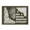
  3. Using a stencil scrape texture paste through it in random places. Leave to dry.
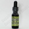
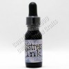
  4. Spray with distress stains – I used antique linen, tea dye and iced spruce. Heat dry.
  5. When cool give a coat of glue n seal.


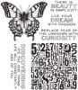
  6. Stamp quote on scrap of distressed/inked card and print out your own quote, colour in letters with distress markers and ink edges.
  7. Adhere to pages.


  8. Take a vintage photo and a walnut strain distress marker and draw and smudge lines around the hearts and quotes to create shadows.

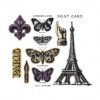
I really didn't know where I was going with this when I found a bag of die-cut hearts and just went for it. I'm really quite pleased with the effects and colour combinations

One of the best places to look for inspiration is other other artists and crafters. The smudging technique has been around for ages but it is one Tim Holtz used on his February tag - and there's another fabulous place to try out new ideas and techniques, it's one place I go every month to see what new inspiration is up on his blog.

I hope you are enjoying sharing your art. I love seeing your new creations popping up on my blog post and you can have the same if you share the link to do so.

Add this link to the very bottom of the html page - be careful here because if you don't know what you are doing you can totally mess up your post. I googled it to find out how to be sure I was doing the right thing.

Here's the link to share if you would like to.


Thanks for stopping by.


Listen to your HeArt

hugs Brenda xxxx


Tuesday 24 February 2015

One layer no: 3 – Crafty Individuals.

Just catching up with a Crafty Individuals card. I think this was the most favourite of  four cards I made for a one-layer workshop last October.
I cheated a bit as we cut a separate piece of card on which to do our design and then adhered it to a proper card when we were happy with it. However there are no embellishments or layers of any kind, so from that angle it is definitely only one layer. Does that count?
P1050792

Cut a piece of card 9 ½ x 20 ½ cms.
Take an acrylic block and dab three colours of distress ink pads direct to it, adding a little bit of vintage photo or walnut stain along the top and bottom edges. (I used victorian velvet, worn lipstick, rusty hinge and walnut stain)
Mist the block with water till you get small globules of colour and the stamp directly onto the card and keep pressing down and you will see the colours mix on the card below.
P1050793
Stamp an image in black archival ink spanning the top and bottom of the strip of colour.
P1050795
Tear some rough paper and position it in the top right hand corner to create an opening, masking off the rest of the card and stamp some music score through it with black soot.
P1050794
Add a stamped sentiment underneath the colour block.
Roughen the edges and ink them with walnut stain. Adhere to a DL card.

Hey presto, a beautiful panel of colour and a great card that can be re-produced in different ways and is flat for posting. 


hugs Brenda xxx

Sunday 22 February 2015

Live Your Dream With Passion mixed media thinlits background


It's my turn to post over at the Country View Crafts Project Blog and I have a card today that incorporates some of Tim's new products, Perspective stamps and Mixed Media Thinlits.

I have more photos and details there if you would like to see them.

Listen to your heART and have a great week.

hugs Brenda xxx


Updated with details from CVC 

Isn't it lovely when the postman delivers you one of those pizza boxes filled with goodies that you have ordered from Susan and when I opened a parcel of pre-order products and found the new mixed media dies from Tim Holtz in it, I just had to have a play.


Before the idea for this card came about I was in the process of making some journalling pages using the brand new stencils from Tim Holtz and using the reverse of the sprayed stencil on some spare card. When it had dried and I picked it up to put away in a bits box I immediately wanted to use the new mixed media thinlits dies, so I ran it through the Big Shot and cut it down to size and I really liked the effects. 

I gathered some elements together and began putting things together.

I stamped the butterfly using the French Flight Framelits set on the background and on another piece of card, cutting it out and adding it over the other one. You can see the grungy background under the frame below.


Some music paper dipped lightly into inks, a ribbon and wishbone finish the embellishing.


I also used the new Perspective set of stamps from Tim Holtz for the sentiment, which was stamped in Olive archival ink.


The piece I found to use for the underneath of the die-cut area was originally created using distress paints and walnut stain distress ink. I don't throw anything away ....... lol.

I really love the effects these mixed media dies create and you get four different designs in the packet.

Happy crafting.


hugs Brenda xxx


Friday 20 February 2015

Lucky No:13


I am hosting the very last challenge of our first year at A Vintage Journey. In two weeks time we are celebrating our first birthday so of course there will be some surprises, but for the next fortnight the theme is 'Special Numbers'. So if you are thinking about a project to enter you do not have to use Tim products although many of the things he produces have numbers on - papers, stamps, remnant rubs, stencils and idea-ology to name a few. You choose how to incorporate your significant numbers it could be birthdays, age, anniversary or the lucky ones! Use them on any project you wish and explain the importance; it needs to be one of those vintage, shabby, mixed media, journaling projects that has a Tim Holtz influence. 


My piece today began it's life last weekend at the Stitches trade show when I sat with Mark Gould and Astrid at the DecoArt stand and we used the fabulous chalk paints from DecoArt and stencils designed by Andy Skinner.


I have added other layers since I have been home. Using watering can archival I stamped a scratched design from Tim’s Slight Alterations set of stamps and added some walnut stain distress ink to the edges then gave it a coat of glue n seal.


Taking a piece of greyboard I die cut Tim’s arch, oval, label and shield and altered each piece ready to layer up.


The arch was stippled with iced spruce and broken china distress paints, heat dried and given a coat of rock candy crackle paint. When dry I painted over a thick wash of picket fence distress paint and when that was dry I stamped the numbers from Tim’s new set called Perspective.


The oval was given two coats of antique linen distress paint, dried and the edges were distressed with sandpaper and a wire brush and then given my 'layered marble' using distress paint technique. (I think a tutorial for this technique will be along soon). 


I added some remnant rubs and another of Tim’s new products words from the Small Talk stickers. I love these new chatty words and when they were stuck on I created some shadowing with a distress marker.


The shield was given the same treatment as the arch with two coats of distress paint, dried and edges were distressed with sandpaper except on this piece I used brushed pewter distress paint. The enamelled tag has a remnant rub word and I distressed it with some glue n seal mixed with a little walnut stain distress ink.


Having gathered some other small items and altering them all in some way (usually with some distress paint), I put it all together adding shadows to the words, distressing the remnant rubs with a wire brush and outlining the # 13 with a black pen to bring it to the foreground again.


So there's my Lucky No:13 wooden plaque that I 'm really pleased with. Thank you for stopping by to take a look and I hope we see you over at A Vintage Journey where you are in with a chance of winning a £10 voucher from Country View Crafts.

Have a wonderful weekend and always listen to your heART.

hugs Brenda xxx


Thursday 19 February 2015

A Visual Journey #8

I had a great time at the Stitches Trade Show Sunday, Monday and Tuesday and spent some time at the DecoArt stand chatting to Andy Skinner and Mark Gould when they were free. I also did a couple of make and takes with Mark and also Andy's workshop. Andy was very generous and gave us two sets of his new stamps, one of his new masks and some acrylic paints from the new media line.


After being pretty in pink and very feminine last week, this is much more grungy, industrial and masculine this week.


I started with DecoArt media fluid acrylics and very lightly brayered yellow iron oxide, phthalo grebe-blue and phthalo blue in layers drying between each one.
 Next I brayered watered picket fence distress paint over the top and dried.


To finish I added a watery wash of quinacridone gold.


For the next stages I stenciled using the fluid acrylics and a new stencil from Andy called Industrial Elements and then took a cog mask and used peacock feathers and evergreen bough distress ink to create more depth in the background.


Over this I stamped  with two stamps from Andy's new Steampunk set........


..... finishing with the clock and the butterfly key from the set stamped onto left over distressed card from another project.


Lastly I die-cut some cogs from paper scraps ..........


..... which finished the composition for me.


If you are having fun with some journalling then please link up to this page and show us what you are doing and take a look at other inspiration from fellow travellers. This is just for fun. 
Thanks to those who have been joining in.


Here is the Linky code for you to use.

get the InLinkz code


Always listen to the heART.

hugs Brenda xxx


Wednesday 18 February 2015

Tim's tag for February

I actually made this tag on Valentine's Day following Tim's process steps but making a few changes as I went along.


The background had been started earlier in the week, but the rest of the tag just came together so well.


I really wanted to play with colour with this technique so I actually chose papers to fit in colour schemes and made up four basic backgrounds........


.... and this is the one I chose to use - pinks for Valentine's Day.
  

All the embellishing was based around Tim's design, I added lots of Victorian Velvet distress paint to all of them to bring the colours in together. You can just see some touches to the inside and outside edges of the frame. The lady is from the Lost and Found paper stack.


I really enjoyed playing with the arrow and heart. Tim used a felt heart on his tag but this one was die-cut from foam, stamped with potting soil archival ink and a little gathered twigs distress stain smeared over it to take away the bright vivid pink that it started out as. The wings are little charms from my supplies also altered with VV distress paint and then a little picked raspberry stain baked into it with the heat gun.


I have just received Tim's new set of Watercolor stamps with some gorgeous butterflies on it, so I played with distress stains on watercolour paper to create this little beauty.


Finally I shabbied and shadowed the tag background as Tim shows us to do ....


... and created my own design.


Thanks Tim for another wonderful tag and background idea. I shall certainly be making more of these, they are great fun to experiment with. I am off to link this one on Tim's February tag blog post and to take a look at the other entries where there is always more inspiration in abundance.

hugs Brenda xxx