Friday 29 April 2016

April Tag Friday for AVJ

Well it's taken me a week since I have been back from holiday to get my head back into crafting and this is my offering for our Tag Friday post at A Vintage Journey.


I began by choosing the largest tag size I have which is a giant #12 knowing that I wanted to use a layered butterfly that was coloured up when teaching my reverse canvas (Here if you missed it). First I scraped over white gesso and heat dried it and then scraped over white crackle paint and left it to dry naturally.


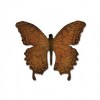
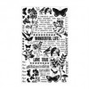
Whikst the crackles were beginning to appear I started to gather all the elements together that I thought I would use for the focal point and collaged background. The butterfly was embossed with distress embossing powders and had paints dripped into the recesses before being sealed with Americana gloss varnish spray.


The wooden boards were left over from experiments or demos with my wooden board technique. A tutorial can be found on AVJ here.


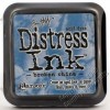
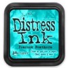
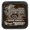
I decided to give this mini tag the same treatment as the giant one with the gesso and crackle paint then blended it with peacock feathers and broken china distress inks, distressed and inked the edges with ground espresso and finally dipped and dried using evergreen bough, stormy sky and broken china DIs.


When the giant one was dry I dipped it in cadmium red, hansa yellow and titanium white media acrlic paints spritzed with water and spritzed them on the tag too to create this mottled effect.


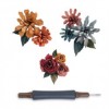
Using Tim Holtz dies I cut various flowers and the words from mop up and discarded painty papers, added some remnant rubs .....


... and you can also see how the crackle came out with the blended and dipped paints over the top.


I also used the tiny tattered florals to add more dimension .....


... alongside the butterfly.


This really is a huge tag measuring 10 1/2 inches tall.


Thanks to everyone who visited and left comments whilst I was away, I now need to get back into a routine of keeping in touch with you all so I will be visiting asap.

Please pop over to AVJ to see all the other amazing tags from the team.

Have a great weekend.

hugs Brenda xxx


All products are available at Country View Crafts

Tuesday 26 April 2016

DecoArt Mixed Media Team project #1

Hi Everyone - have you missed me? I have been on holiday for a couple of weeks so my posts were scheduled whilst I was away. Having found the sun in Lanzarote I would still love to be back there but I have been waiting for this post to go live and I'm really happy to be home, looking forward to creating and blogging again.

Those who know me will appreciate the excitement I felt to be asked by Andy Skinner to be a member of the DecoArt Mixed Media Team and the excitement continues with the publication of my first project on the DecoArt Mixed Media Blog.

Here's a sneak peek and if you click the link above you will be transported over to see it in full with all the details of how I put my layered frame together.


As you can see it's a piece of altered art with lots of techniques and painty layers to create all the effects. I wanted to do something that was a bit different and where I could use the inspiration I have gathered from Andy but still make it my own.

If you manage to take a look please let me know what you think.

Thanks for stopping by.

hugs Brenda xx

Friday 22 April 2016

Canvas Board for CVC

Today I am over at Country View Crafts Project Blog with another of my canvas boards. Having attended Tim's class at the Stitches Trade show back in February I used some of his ideas and design to put a collage together and had more fun with the distress crayons.


I have shared the process steps and products I used to make this and I have to say I really like the background with those gorgeous deep colours and texture and I finished off with some foiling which makes it look even more opulent.

I would love it if you could pop over to take a look at the details and photos.

Huge hugs Brenda xxx


Updated from CVC project blog

Hi it's Brenda here with another of my canvas board projects.
In February when I went to our UK craft trade show called Stitches I was lucky enough to attend a workshop with Tim Holtz and watch him demo several times on the stands. It was fabulous trying out the new Distress Crayons and thought I would use some of the techniques he taught us and demoed and add any of my own to make this canvas board. The design is similar to the one he taught.


I began with set 2 of the crayons, scribbled some of the colours over the board and spritzed with water. Although they have a short smudge time when spritzed and rubbed with your finger the pigments are activated and will blend together. The depth of colour depends on how much water you use. I made mine quite wet and dabbed with a piece of kitchen roll which took some of the colour out leaving the board underneath exposed again. I heat dried it. But the colours looked pale so I took set 1 and set 2 and lots more colours blending them together.

To add another layer I took aged mahogany, rusty hinge, bundled sage and brushed corduroy distress inks and blended over the top. Now I bet you would expect the crayons to blend around with the inks but they don't, the inks give a complete new layer over the top. Next I gave it the dip and dry and the spritz and flick treatments drying with the heat gun.
Following that I stamped the lattice stamp in black archival to begin to get more interest.


 The colours are very deep at this point and I love using white as an 'absorber' to give the whole piece a more muted effect. So out came the picket fence distress spray stain and a few quick spritzes plus some light sprays of water I got what I wanted to achieve. I gave it a coat of micro glaze and a spray of matte sealer.


Next I chose some ephemera pieces and adhered to the background. Silly me didn't let the spray dry enough so some of the colour moved but I don't think it detracted from the look of the finished piece. Now to add dimensional texture and I used opaque matte texture paste through a stencil and let it dry.

Using the medium brush I applied crazing collage medium over the complete surface and let it dry. Whilst that was happening I die cut some greyboard numbers and painted them with tarnished brass distress paint. I also took a word key and painted it with tarnished brass and picket fence distress paints.

Because the surface is now completely sealed on the canvas board I came in with some of the crayons and smudged the smooth pigment again to add deeper colour and to create interest on and around the ephemera pieces and the texture. The crayons also pick up the crazing which gives a beautiful porcelain effect, it was impossible to photograph on canvas.


I finished off with another piece of ephemera and one of the found relatives girls cut down and then added the key. Well I say it was finished but I waited till the next day to photograph it in the light and at this point thought I would add some glue stick foiling, can you see some of the traces of it?


 So happy with this piece.


Thanks for stopping by and have a great weekend.

hugs Brenda xxx


Thursday 21 April 2016

Upcycle for Frilly and Funkie

I am so pleased to be a guest over at Frilly and Funkie today where the host is the lovely Suzz and the theme is 'It's not easy being Green'. In honour of Earth day which is tomorrow we are to create an upcycled project and to repurpose an existing item, recycle an element that would usually be thrown away or use scraps in a creative way. On this project I've taken lots of scraps destined for the bin and altered, adapted, recycled and upcycled elements.


I started with a tin that has been sitting on a shelf out of the way for a couple of years. I nearly threw it a while back but held onto it 'just in case', you know how you do? I decided to take it out and when I realised my new little collection of cabinet cards would fit in it, I knew where I was going with it.


I took out some media acrylics and a piece of dry kitchen roll and dabbed burnt sienna all over and heat dried it. Of course metal gets hot so we need to be very careful we do not burn ourselves.


The next layer I used burnt umber and dabbed it over randomly leaving some of the burnt sienna showing and dry.


I repeated the random dabbing with paynes grey and heat dried. Now we a beginning to see a lot less of the pattern underneath.


The trick now is to use all three colours together so they are wet at the same time and you can blend them together and over the previous layers.


The using a paint brush paint a coat of quinacridone all over.


Then finish with very light and random patches of all three colours again.
 As you can see there are minute changes in the last three layers but you see it happen when you do it yourself irl and you have control of what colour goes where.


I left the tin overnight and put the lid on, I wanted to see if the paints would get rubbed/scratched off with opening and closing the lid, but I'm pleased to say there was no wear, however I am sure there will be over time and I don't think a layer of varnish would prevent it.
The next day I scraped on a layer of transparent crackle glaze and left it to dry.


I took the time then to decide on what embellishments I wanted to add.

Birdcages - given a watery coat of cobalt blue hue and metallic silver mixed and dried. Some areas were sanded back and then a watery wash of quinacridone gold painted over. More sanding back and ground espresso ink blended in. These were saved from my friend who was going to throw them out, they are muffin bands.


The butterfly - this was a mop up piece and painted so I didn't waste paint from a previous project - it had been given a rough coat of phthalo blue mixed with translucent white. I blended ground espresso over it and flicked it with water, then dried. I splattered watery cobalt turquoise over it, dried and repeated with watered down metallic silver. Next came a coat of quinacridone gold wash, dried and a quinacridone gold glaze (ultra matte varnish coloured with the quin gold paint). Later I decided this was a bit boring so I painted over with the clear crackle glaze to see what happened. Yes some tiny cracks appeared when I rubbed in white antiquing cream and to take the shine off of it I gave it a coat of ultra matte varnish, oh and that's not until I had sanded and inked the edges again!


The bottle -  was left over like the butterfly and had the same coat of phthalo blue and translucent white. I gave it a very thin coat of translucent crackle glaze and when dry blended over ground espresso again but it looked too dark and quite uninteresting so I painted over a thin coat of white crackle paste and I love how it picked up the distress ink as it dried. I finished off with some watery cobalt turquoise and quin gold and once more sanded and blended the ground espresso on the edges. Now it looks better.


The arch - was left over from another project and I think had been dipped in quinacridone gold and paynes grey. I took it, sanded the edges and blended in ground espresso. What happened next was totally unexpected - the distress crayons and mini latticework stencil were lying on the floor (as they do!!) so I decided to bring in some pattern and hey look what it ended up like - love it.


The chloe stems were left after designing a workshop project and I had one die-cut in peach and another in cream, I decided just to give them a quin wash and then a little paynes grey.


The image was printed from the computer and needed aging and as I was enjoying crackling everything I remembered my friend Julia's images on a project where she had cracked them too. So I got out some new Tim Holtz goodies, coloured the image with distress crayons and a water brush and then sealed it with crazing medium. Not sure I like it really!


Look what happened to the lid when I went back to it and the crackle glaze had dried and I had blended patina green antiquing cream over it. Maybe I had got it a tad too thick in places with the glaze?


I die-cut Tim's new lace thinlits dies three times from some waste card that had been given some rusting and patina treatment a while back and adhered them to the sides of the tin.


Then I put everything together to create a collage on the lid with all the elements I had altered and saved from destruction.


And here are my cabinet cards I bought at Brick Lane Market a while back, they're 2 1/2 x 4 ins. Two of them have dates on the back of 1870 and 1872, I think they are amazing.


I think they will feel right at home in this 'ancient' time-worn tin!!!


Thanks to the fabulous team at Frilly and Funkie for having me as their guest today.

hugs Brenda xx

A quote I found and included in my Frilly and Funkie write up.

“Thanks to my mother, not a single cardboard box has found its way back into society. We receive gifts in boxes from stores that went out of business twenty years ago.”
― Erma Bombeck