Wednesday, 1 March 2017

Tim Holtz inspired for CVC

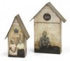
There is a brand new challenge at Country View Crafts today and the lovely Christine has chosen 'Inspired by Tim'. Now as you all know I love Tim's style and products and recently I purchased his Tiny Houses die and I just had to have a play.


I began by cutting the pieces from mountboard.


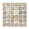
Then I used Tim's Wallflower papers to cut out individual pieces to adhere to the mountboard.


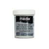
I realised the corners would be on show so I spread some texture sand paste over them and let it dry ....


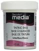
.... and decided to paint them using white tinting base and burnt umber media acrylic paint.


When it was all dry I adhered the pieces together, gave them a coat of decou-page on the surface and put them to one side for a couple of hours while I went for a walk waiting for them to dry out completely.


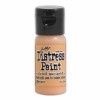
When I returned  I spritzed a little water and blended over picket fence distress paint to tone the colours of the papers down a bit.


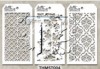
Then I used one of Tim's mini stencils to sponge through some dried marigold distress paint.


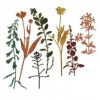
I stayed with the nature theme and added some of Tim's new Wildflowers thinlits on both sides cut from core'dinations papers.


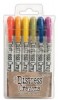
Then out came the distress crayons to add some more colour


Finally before adding any embellishments I sanded and inked all the edges.


The colours didn't have enough contrast with the background so I used black and white pens and painted some tinting base between the flowers and leaves then added distress markers over the flowers and foliage to strengthen the colour.


The small talk sayings are perfect to give some meaning to each little house and I painted some greyboard pieces to give them something to stand on.


I hope you like my take on being inspired by Tim, it certainly gives me so much scope as I love so many of his products and playing with something new is always a treat.


hugs Brenda xxx


Sunday, 26 February 2017

Water colour colouring - Watercolour powders 4

I've decided I will make a technique journal this year and have started with the water colour powders.


Experimenting a bit further with the water colour powders I began with the brown bister sprinkled over the water colour paper and then spritzed an old stamp with water and pressed it onto it, repeating lots of times until I had it fully covered the paper.


I then stamped an old Tim stamp with ground espresso distress ink over the top.


Taking a fine brush, some water on my craft mat and chipped sapphire and stormy sky distress inks I began painting in some of the designs and finger splattered some blue onto the background. I love the browns and blues merging together in some areas.


I repeated the process with antique linen and tea dye.

As this is a journal I thought I would keep it simple and add one of Tim's small quotes.


And hey presto the first page is done.


I can see me using this technique for my Packhouse cards. It will be interesting to watch what designs will sell. At the moment I am gathering up Mother's Day style bits and pieces and making some shabby cards to do a changeover tomorrow - just trying to keep to the themes of the year. I had forgotten how much I love shabby card making - I can see some appearing on here soon.

Happy Sunday.

Listen to your HeArt.

hugs Brenda xxx

Friday, 24 February 2017

Globe cards and Packhouse news

I am sharing some cards I needed to make because I now have a small shop space to sell my art and crafts projects - be it canvas, shadowbox, canvas boards, tags or cards - I have some on display and I was very lucky to sell my first piece within 30 hours of 'opening'.


I have this wall space in the PackHouse, a 400 year old building nestled into the Surrey countryside in the village of Runfold near Farnham. It was once a hop house as this was at one time a huge hop growing area and although that doesn't exist anymore we do have the Hogs Back Brewery which still keeps up the local tradition of local beers. The Packhouse now is a place to buy antiques and items for the home, all being of a vintage shabby style, so my work seems to fit quite nicely.


The details of my globe cards are over on the CVC project blog today -


Tim's globe die has to be one of my all time favourites and I used both card and core'dinations papers to make these.

Hope you've had a good week. Enjoy your weekend whatever you have got planned.

Take care.

hugs Brenda xxx

Monday, 20 February 2017

Watercolour Powders 3

Sharing another background and card using the powder water colours, I have bistre's, brushos and infusions in my collection. I love the very mottled and watery effects you can achieve using them with a stencil. If you missed #'s 1 and 2, click on the numbers to be transported over to take a peek.


The background was created by lightly shaking watercolor powders over a stencil (make sure you have a piece of card underneath to create a second background) spritz the stencil with water. (The depth of colour will depend on how much powder you sprinkled on and the watery effect will depend on how much you spritz onto the stencil - play and experiment to see what effects you can make). Take your background piece of card and flip the stencil over onto it, rub over gently with a paper towel and remove the stencil to reveal the first layer. Heat dry.
Dry the stencil, place it back over the the background pattern. Blend distress inks through the arrows, I used pumice stone, stormy sky, and gathered twigs. Remove the stencil, spritz the card with water and heat dry. Press under something heavy to flatten it.


Collect together some items to build up the focus for the card. The cogs had been made before and thee corner had been rusted and not used on a previous project so I like to hold onto these bits and get them out when needed and not waste them. 


I do however also have a 'rusting' session sometimes. Bits from Andy Skinner packs, chipboard pieces and die-cuts. Again I keep bits like the hexagons that are the 'waste' from a die, these look great as bolts.


These were given a rough and random coat of paynes grey, then some stipple burnt umber, a third stippling of cerulean blue, phthalo turquoise, burnt umber and a little tinting base (mixed, blended and changed every time I picked some up from the palette) then a coat of quinacridone gold finished with a wash of quin gold and phthalo turquoise mixed together.


I took this photo just to show how I adhere metal pieces that have a recessed back like this corner. Just fill it with modelling paste which acts as a glue.


The photo is one from my collection.


Hope you're enjoying the watercolor series.


Have a great week.

hugs Brenda xxx