Friday, 12 September 2014

The Voice of the Sea–Crafty Individuals

I am still playing with one layer stamping and prisma colours, but this time I added the quote as an extra layer. I think I am dreaming of an Indian Summer, although we have have had some gorgeous warm afternoons this week. Long may it continue, but have you noticed the evenings really drawing in?
P1180486web
I began with a tag and the wrinkle free distress technique.
P1180480web
and then started stamping images from CI-384 and CI-272. The lighthouse stamp is a collaged image so I wiped away some of the archival ink before stamping it. This gave me just the lighthouse and some of the gulls.
P1180483web
I then used Prisma pencils to colour in….
P1180492web
…. finishing off with a charm and ribbon.
P1180493web
Thanks for stopping by today, I really appreciate your visit.


Tomorrow I am going up to London with Ken, we want to see the flow of poppies at The Tower, they look amazing on all the photos, but like everything seeing them irl will be so much better.

Catch you later.

hugs Brenda xxxx

Thursday, 11 September 2014

One layer stamping

Just a quick post from me today.
I am teaching a workshop on one layer stamping in a couple of weeks time and making a couple of cards so I am playing with masking and layering stamps to get back into the swing of things.
P1180445web
An easy one to start me off using the fabulous Chemist set of stamps by Tim Holtz.
P1180446web
I am also experimenting with mixing Prismacolour and water colour pencils to se what effects I can achieve. Mmm starting to like what is happening with the colours, must try this out more.
P1180448web
I hope your week is going well. On Monday I had lunch with Nikki Acton from Addicted to Art and A Vintage Journey teamie, we also mooched around the shops in Camberley before having a coffee before we went home. Lovely to catch up with you Nikki.

Off to the Art of Craft today teaching a workshop using the lovely Graphic 45 papers.

Hope your week is going well.

hugs Brenda xxx

Monday, 8 September 2014

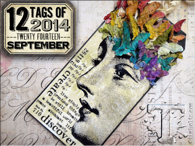
Tim’s tag for September–a note book cover

This is my first effort and because it went totally wrong I guess I’ll be trying another one soon. To see Tim’s tag and all the details as to how he made it pop over to his blog to be amazed. Once you’ve seen the process for the background then you’ll understand what went wrong and what I’ve done to this to salvage it.
P1180386a
This is Tim’s tag.
I used Willow for the first layer and then blending solution and Lettuce through the stencils. Although it isn’t what I set out to achieve I do like the results  and carried on using it to make a cover for a sketch book.
P1180382a
The leaves were given the same treatment as Tim’s butterflies.
P1180391a
Stamps used – Bird Feather, Thankful Silhouettes, Classics #17.
Strip die – Autumn Gatherings
P1180392a

Another great tag from Tim and more techniques to add to our tool box to use.

Thanks for stopping by today, have a great week.

hugs Brenda xxx

Friday, 5 September 2014

With a Flourish for A Vintage Journey

For some reason when looking to start this Creative Guide piece for AVJ I got to thinking what ‘flourish’ means, things like – to thrive, prosper, be at the peak of condition, to make bold, sweeping movements and looking at the interpretations helped me to focus in on what I wanted to show through my project, which is the boldness of the curves in flourish shapes; the similarity in some of the beautiful flourished fonts we use and a beautiful lady at the beginning of her adult life.
P1180353
Our host for the new challenge at A Vintage Journey says - 
‘Have you ever noticed that much of Tim's packaging includes that fabulous flourish? It has always been one of my favourite Tim images, so for this challenge let's see what you can do with your flourishes!  You might not have the "actual" Tim flourish but I am sure we all have a flourish die or stamp in our stash which can get the shabby/vintage treatment’.
So off we go on another route of this Vintage Journey, let’s see where we get to then.
P1180356
Stamp  ( Fabulous Flourishes) in walnut stain over the tag. Using the flourish text from the Merchantile stamp set ink with embossing ink and stamp randomly over the top, cover with clear embossing powder and heat set.
P1180322
When cool ink over tag with chosen colour (I used Victorian Velvet) and edge with brown (I chose Brushed Corduroy).
P1180326P1180328
Add collage elements, the photo is of my grandmother when she was a young lady. Finish with embellishments, including a couple of flourishes from the festive greenery strip die and some ribbon. Can you see there are even flourishes on the strip of patterned paper I added?
P1180357
And there we have it ….

I hope you will join us this fortnight for Jennie’s challenge at A Vintage Journey, you do not have to use Tim Holtz products but tell us what inspired you of his to make the project. My Tim inspiration this time round are the stamps, flourishes from the spring greenery die, ephemera and heart embellishment.

I hope you will join us on this leg of the journey and share a project that has been inspired by Tim in someway. I’m looking forward to seeing what you share.

Have a great weekend and hopefully some time to create and make.

hugs Brenda xxx

Thursday, 4 September 2014

PaperArtsy Mini printer Tray


Hi everyone, I have a guest project over on the PaperArtsy blog tonight.
I used a Tando mini printers tray and had great fun creating a little scrapbooking project which turned out completely different to what I had imagined, but there goes my creative muse with a mind of her own and taking me off in a different direction, but that’s what so exciting about creating your own art isn’t it?
 
Here are some of the photos, but do go across to the PA blog if you have for more details.
 
PHOTO 1 0914PHOTO 3 0914PHOTO 4 0914PHOTO 5 0914PHOTO 7 0914
The photos are of my children, Ben and Maddie when they were much smaller and of my dear Mum and Dad.
 
Thank you to my new Followers for taking the plunge to see what I create, I hope you find some inspiration along the way and thanks for taking the time to stop by today.
hugs Brenda xxx


Monday, 1 September 2014

Nautical

The new challenge at Country View Crafts has a wonderful nautical theme to it, chosen by our lovely Jennie who loves to be on the sea. I also love the sea and always thought one day I might live on the coast somewhere but it never happened but that doesn't stop us going down to the coast as and when we can. In fact I was in Portsmouth on Saturday night for a walk and a lovely meal at Jamie Oliver's restaurant.

P1180294

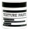
For this project I chose to use the back of a deep canvas to make this shadow box effect display and began with some white paint, torn strips of patterned paper and texture paste with stencils.
P1180291

I added a couple of the canvas stretchers first of all to provide me with something sturdy on which to add some of the elements and bring them nearer the front. I painted the inside of the frame with white emulsion and when it was dry I adhered some torn strips of patterned paper.

P1180293

I rubbed some gesso over the paper with a dry paper towel and then using texture paste and a palette knife I added the textures around the edges of the frame.

P1180304

For the background I chose a piece of Tim Holtz paper and added some bubble effects with the texture paste and used a few blue distress inks over it. This gave me the base to add the elements I had chosen to use. You can see I had great fun with the rusting powder and alcohol inks to give the metal embellishments a really aged look.

P1180300 P1180301
I also used Tim’s crackle paint and distress paints on this little bottle and found a video on the internet and learnt how to make this Celtic Plait.

P1180305 P1180303
Whilst I was making this I knew I was going to see some friends on Saturday night on the way to Portsmouth and they have a lovely beach hut and the colours I was using reminded me of it, so I decided to add the name of the sea-shore abode ‘Y’ Knot to the label pull and take this with me for them.

P1180306

Did you see the little battleship on the top of the letterpress? It’s from an old Monopoly set and given a bit of an alcohol ink treatment and I don’t have an anchor so I used some old jewellery to add the hanging ball and chain.

P1180307

When Ken saw this he thought it would be very apt for Jill and Dave, our friends, as the old liner on the tag is like one that used to come into Southampton and the battleship is a reminder of the naval presence at Portsmouth and our friends live between the two.

I hope you’ve had a great weekend and if you have the inspiration and motivation to make something Nautical, we would love to see you over at Country View Crafts. Do go take a look at all the wonderful inspirational projects by our amazing team.

Thanks for joining me today.

Have a great week and a wonderful September.

hugs Brenda xxx