Friday, 5 February 2016

We are going industrial at AVJ

P I have loved putting together my February CG sample for Tracy's 'Industrial' challenge at AVJ. In thinking about the terminology and meaning of industry we think of factories with rising chimney stacks exuding steam and smoke, metals, mechanical and automated machines, blast furnaces, manufacturing industries, car plants and so on. But I also like decayed metals, particularly rusty ones so I turned to Tim's faux, riveted metal effect, his remnant rub background and idea-ology combined with DecoArt media acrylic paints and mediums to produce this Curio Box.


Easter is approaching and I had bought a papier-machie egg from Hobbycraft last week and decided to use it. Having found an old Ipod box in my drawer of alterable items everything started to come together in my head but the egg was going to be difficult to stick it in the box so I cut it in half using a craft hacksaw.
The egg was first covered in foil tape to give it a good covering of silver and then I cut and marked pieces of Tim's foil sheets and covered over to give it a stronger layer. Next I used media acrylic paints coating thickly, semi drying between each layer and wiping back. I used black. prussian blue, burnt umber with burnt sienna mix, and quinacridone gold. But I didn't get the effects I wanted as when I rubbed the paint away between each layer I had a stark contrast between the silver and the coloured paints.

 
So next I added some alcohol inks but it looked too false. Nothing to do but change it completely then..... I added some random and thin amounts of sand paste and dried then some mid grey and paynes grey paints. I blended some black round the edges, dried it and then added a paynes grey wash before quinacridone gold again. Ok it's not like Tim's 'Heart and Soul' heart which is where the inspiration came from but I quite like how it has turned out.

 
So onto the box. I gave it a coat of black gesso inside and out then did Andy's mega crackle technique on the outside with the decoart weathered wood and crackle paint so I painted the inside of the box with white gesso to lighten the whole thing. The mega crackle worked brilliantly with the large black cracks.
 When it was dry I gave it a coat of matte varnish and then a watery wash of prussian blue and quinacridone gold before adding some remnant rubs.


For the background behind the egg I revisited Tim's January tag of 2014 but changed it a little and used distress sprays and remnant rubs.


The butterfly is one of Tim's duo set,  I feel a tutorial coming on so keep a watch out on the Destination Inspiration posts next month but you can see it is well rusted and has that industrial feel to it.


The word curio is made up of Tim's alphabet blocks with the letter shapes given  a very light dry brushed layer of gesso and then a wash of quinacridone gold acrylic paint. I dabbed vintage photo distress paint over the arrow and when dry brushed a little treasure copper on it.


Finally I had almost everything made to put it together. As always my eclectic mind gathered more bits along the way and I added some natural materials, moss and husk hair to provide more interest. You can also see I found a rusty spring and finished off a little bottle that had been part painted. You can also just make out a tiny star in the moss which was punched from Tim's punch using left over card I had altered to look like rusty metal and glued it to a memo pin.


I love the butterfly adhered to the crown of the egg ......


.... and the blocks glued to the top of the box.


Here you can see how the egg and butterfly protrude from the front of the box - had to pack it out with chipboard first otherwise they would have disappeared inside.


I think the mix of industrial and natural materials have worked really well together and have put me in the mood for Spring.


Now it's finished I am very happy with the outcome and this has become one of those rare pieces that I would like to display in my house and I know I will use it for my sideboard Easter


I hope you can find some time to pop over to the AVJ challenge blog to take a look at all the other inspirational pieces mage by the very talented Creative Guides and if you take a shot at entering you could be in with a chance of winning a £20 shop voucher from Country View Crafts or being one of our Pinworthy Mentions.


I am adding my industrial butterfly on the egg to the Frilly and Funkie challenge 'enjoy your embossing'

Thanks for stopping by and have a wonderful weekend.

hugs Brenda xxx


Create your own visual style... let it be unique for yourself and yet identifiable for others.

Orson Welles

Thursday, 4 February 2016

Layering mixed media background for CVC

I am sharing a mixed media, layered background over at Country View Crafts project Blog today. It has lots of layers which I am loving at the moment, especially with my recipe workshops.


If you would like to see further details click the link above to be transported over. I will hopefully use this background soon and think I might even chop it into ATCs.

Have a great weekend.

hugs Brenda xxx


Updated from CVC project blog

Hi it's Brenda here with you today. 

I am sooo into journalling again at the moment I thought I would share a recipe to create a background with you that also fits with the new CVC challenge.


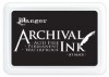
For the base layers I began with some of Tim's papers glued to my paper, stamped over it with red geranium archival ink and scraped a layer of gesso randomly over the page from top to bottom. I added some tissue tapes and then gave the page a light wash of colour using a babywipe and hansa yellow light with phthalo blue DecoArt media acrylic paints.


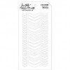
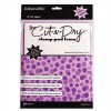
At this point I thought I would choose a travel theme to work with so for the next level of layers I stamped some clocks, postmarks and stamps using black archival. Next came another layer of gesso this time scraping across the page. Gesso seals, tones down colour and can add texture so is a very versatile medium to use. Then taking some cut 'n dry foam and a little raw umber paint on it I dabbed gently through the chevron stencil to create more interest.


 Now comes the top layers - stamp using some old collected plastic lids using gesso, just randomly and off the page and dry it. I stamped over the brown chevrons as I wanted to tone them down more (which comes in the next layer).


Then to finish with the top layers finger paint titan buff and titanium white into the circles to create more colour. This is where I stopped but when I come to use this page (and I might even chop it up to make ATCs) I have a base to work on where I could add stamped lines, doodling,some second generation text stamping.


Thanks for stopping by. I hope this inspires you to join the challenge over at Country View Challenges.

hug Brenda xxx


Monday, 1 February 2016

Make your own background for CVC

I love to make my own backgrounds for projects and card making and I'm also loving making little media boards, experimenting with layers, textures and colours. Today though for my background I am playing safe by repeating one I did before Christmas on a much larger board that went to my friend Alison for her Secret Santa gift - which can be seen here, you will see the similarities on my small one.

I began by sanding the edges of the board and stamping using Tim's classics #13 set. Postmarks always make me think of trips and holidays so I chose that as my theme.

 
I added some crackle paste through a stencil and let it dry.


Once dry and beautifully and finely crackled I dipped it in tea dye and iced spruce distress stain and then just played with layers using white acrylic paint, white linen ink spray, gathered twigs splattered using a new splatter tool I just got hold of in hobbycraft and spritzes of water......


.... and finally dried it and distressed the edges blending in ground espresso DI. So although I started off by thinking I was going to repeat a background I had already done, in fact, like always, I went off piste and mixed things up a bit - but that's what following your muse is all about isn't it?


The embellishment trail started by making some rusty looking signs using an embossing folder, decoart media fluid acrylics and some metallic lustres. I didn't record the steps because I was just having fun with the products and the layers until I was happy with the overall effects but I know I used quinacridone gold, raw umber, paynes grey, prussian blue, sap green and titan buff paints with champagne ice and iced espresso lustres.


I chose this guy as my focal image because he looks as though he is dressed ready to embark on a long journey, perhaps on one of those huge ocean going liners or even an aeroplane that was becoming more popular. He was excited to be off to explore foreign lands, perhaps as an archaeologist dreaming of finding a new pyramid in Egypt or maybe dreaming of starting work at the British Museum, hoping to assist, organise or even take part in excavating expeditions.


 I had this green metal frame sitting on my desk so decided it would add tremendously to the masculine feel and set about altering it.
I covered the frame in a light coat of gesso and then random patches of white crackle paste (I think I kept it a bit too thin as not much crackling went on - but something to learn from). You can see the final results below.


 When the crackle hadn't worked for me I decided to add some sand teture paste and used the media acrylics when it was dry to create this very textured rusty look.


I set about making the rest of the collage elements ....


.... and creating the collage itself.


The rusty adventure sign worked really well....


... as did the background.


Once assembled all I needed to do was add a rusty wire hanger and hey presto another vintage, weathered mixed media board was born.


So this is my sample for the newest challenge for Country View Challenges - just click the highlighted words and you will be transported there.

Have a fabulous month.

hugs Brenda xxx

Sunday, 31 January 2016

Mix It Up with Tim

 
For his tags of 2016 Tim is re-mixing two of his tag techniques from previous years to bring us new ways of using them. I am sure this will be a blast bringing together old and new ideas to create something completely different and to start us off he has given us chalkboard and industrious metal to work with.


So as Tim has mixed things up a bit so have I.


As you can see I changed the colours and I used pine needles distress paint for my industrial pieces but I also added a wash of black distress paint over the top to get that industrial patina look.


I also reversed the chalk and background colours making my coffee cup more in keeping with the real ones you might get in mine and Tim & Mario's favorite coffee shop. Still using chalks I even added a bit of green colouring to the cup and although not totally clear int his picture the tiny cog has been altered with alcohol ink and copper treasure gold.


The background is Tim's mesh stamp and produced with the chalkboard technique the same as the coffee cup.The word band was first coloured with pine needles distress paint and then antique linen (using Tim's technique for distressing the bands) and I also added some treasure copper to the edges.


I changed the normal string or ribbon for some hessian ribbon painted with the pine needles and black wash and then stapled on with the mini attacher.


Yay, having missed the last three tags at the end of 2015 due to the pressure of additional workloads I now find I am catching up and getting back into the swing of my own schedule at last. Thank goodness as I have so missed joining in. Thanks Tim for a great start to the new year with the technique remix and I am now going to go and link to the January post on your blog.


Have a great Sunday and I'll see you tomorrow with my DT sample for the beginning of the new challenge at Country View Challenges.

Happy crafting.

hugs Brenda xxx