Wednesday, 7 February 2018

Panel 5 - Palaeontological Discoveries

Here's another of the little panels for the Fossil Journal I'm making using the Stampendous Fossils set of stamps and the Illusionary Artists Tech Trauma set, both by Andy Skinner.


Process Steps
1. Stencil the bubble shapes by mixing sap green, titan buff and raw umber media acrylic paints.
2. Paint over a light layer of sating finish varnish mixed with cobalt blue hue paint.
3 Stamp some text with watering can archival ink and dry.


4. Stamp some texture with coffee archival using the same set of stamps. Rub it straight of to get a smudged look.
5. Dip the panel in watery titan buff.
6. When dry - repeat with cobalt blue and burnt umber mixed together. - dry.
7. Splatter some titanium white acrylic paint.


8. Stamp and adhere the fossil.


9. Repeat step 2.


It's only a week and a half before I'm off to Stitches CHSI in Birmingham where I will be doing a couple of demos for Andy and meeting up with lots of amazing friends and artists in the industry. It's fabulous to go and see the stands, new products and chat to people. So as you can guess it's busy, busy, busy here making samples both for Andy and Di at Tando Creative. I can't wait.

Enjoy your week - I hope you can find some creative time for yourself too.

hugs Brenda xxx


Sunday, 4 February 2018

King Spook Hanging

In typical Andy Skinner style these new stamps are fabulous to work with and I used them to create a little hanging to share on Andy's blog today.


I've used the little fella in the bottom left and called him King Spook.
Click on the photo for the links.


Roughly seal the substrate (I used one of my Tando media boards) with gesso, leave some of the outer edges exposed.
 Using the dip and dry technique and watery washes start with raw umber - dry. Add a little cobalt blue to it, dip and dry. Add a little more cobalt blue and some titan buff, dip and dry. Add some titanium white to the mix and repeat.


Stamp text using Spooks and Tech Trauma with watering can, give it a blast of the heatgun and then take a little white gesso with a palette knife - flatten it on your paper/foil palette and the keeping the knife flat to the surface of the board drag small amounts over the background so you get a distressed look.


Stamp the skulls onto tissue paper - I wanted a good clean image over the  rough background. Adhere to the background and give the whole board a covering with matte medium.
Mix a very watery wash of quin gold, paynes grey and quin red and apply to the surface spritzing with water if necessary to keep in light in colour tone - just like watercolours.


I chose those colours so it would tone in with the frame as well.


Cut the TH cameo frame with an oval cut out centre from thin greyboard, run it through an embossing folder and seal with a coat of gesso.


Put a little drops of decoart media acrylics silver, quinacridone red, quinacridone gold and titan buff on a flat palette and take them randomly on a brush and mix and blend them on the frame.


Paint over watery washes of raw umber and paynes grey allowing them to seep into the crevices and dry - repeat several times.


When dry sand the high spots on the surface back to the silvery colour and some raw greyboard and then blend a dark brow distress ink over the whole background and with a babywipe wipe it off again leaving the greyboard areas taking the ink and making the frame look much older,
Don't forget to sand the edges inside and out and blend with vintage photo DI.


Take a piece of media card and dip in watery cobalt blue, dry, and then mix a watery rose colour from the quin gold, quin red and titan buff and dip again.
Using the a stencil apply titanium white through it and stamp some text and numbers from the brand new 'Spook' set of stamps by Andy for Illusionary Artists.
Follow up with a wash of quin gold and paynes grey and dips of those colours with titanium white to get an etheral layered effect.
I stamped the image using aterng can archival ink but because of the stencilling and layers it didn't come out as sharply as i thought it would.


But I knew I was going to paint it in and with some paynes grey and a very fine brush I was able to add the detail in.


Stick King Spook to the back of the cameo frame and adhere it to a second one to give it some substance and dimension .... 


.... and assemble the hanging.


Thanks for stopping by and a especially to those of you who leave me such lovely comments - I really appreciate each and every one.

Don't forget to stay tuned to Andy's blog to see all the wonderful inspiration that gets posted.

hugs Brenda xx

Friday, 2 February 2018

Melt It for AVJ

I have a large wooden tag today which has been layered up with gesso, stamps and acrylic paint splatters and lines to produce the design for the next stage ..........
But before we move on let's take a look at the AVJ challenge brief from the lovely Julia.
This month we're asking everyone to MELT IT! Get out the UTEE (ultra thick embossing enamel), beeswax, encaustic wax, embossing powders or good old wax crayons and a heat tool and get melting to create something in a vintage; shabby; mixed media; art journalling; industrial, timeworn or steampunk style!


I started by sealing the wood with a coat of white gesso and when dry I dipped it into some watery burnt umber media acrylic paint.


To get some clear stamping using Andy Skinner stamps - including some of his new ones- I stamped using black and coffee archival ink onto tissue paper. Mixing in some text as well gives this a fabulous collage feel.


I adhered it to the tag, dried it, sanded the edges to remove the excess tissue paper and then splattered it with titanium white and the the white mixed with some burnt umber and dried both layers separately before using an old credit card to dip into the left over paint and print some overlapping lines.


 This provided some depth  ......


..... and interest to each of the main images .......


... and to help unify the whole piece.


Once this was dry I pondered my next stage whether I should seal it with a coat of varnish or not? I decided not to and went straight into a coat of UTEE. I pitted it with a paint brush before melting it and then rubbed walnut stain distress ink into it and dabbled on some walnut crystal ink to give it a more sepia and aged look.


I hope you will pop over to the AVJ blog to see what other fabulous 'Melt It' inspiration my lovely teamies have come up with - you know you won't be disappointed.

Have a fabulous weekend.

hugs Brenda xxx


Wednesday, 31 January 2018

Panel 4 - A fossil hunter needs sharp eyes.

I think this is going to be one of my favourites from this set of fossil panels, I just love the way it turned out. I used Andy's large ammonite stencil on it and one of his older sets of stamps (Steampunk).


Process steps
1. Seal the card with a layer of tinting base.
 2. Using the dip and dry technique and watery washes start with raw umber - dry. Add a little cobalt blue to it, dip and dry. Add a little more cobalt blue and some titan buff, dip and dry. Add some titanium white to the mix and repeat.
3. Using the large ammonite stencil apply titanium white through it which leaves the stencil shape showing with those beautiful watery hues.


4. Give the panel a dirty wash of green gold, paynes grey and quinacridone gold.
5. Stamp the fish with watering can and coffee archival ink.
6. Stamp some text and diagram with the same colours.


Can you see I added an eye to this one? It is from one of the Tim Holtz remnant rubs sheets.


I've worked out I need at least 15 of these panels for the journal I want to make so there will be quite a few to come yet - hope you're not getting bored of them.

Thanks for stopping by.

hugs Brenda xxx


Monday, 29 January 2018

Vintage Heart Tag

I'm enjoying playing with some new stamps being released by Andy through Stampendous and more elements from the Tagtastic kit 2 from Tando Creative. I made this to share on Andy's blog today.


The tag from Tagtastic 2 kit is being released in February at Stitches. I love the uneven edge it has to it. I began by using some left over silver and white gesso mixed together and brayering it lightly over the surface.


I then dipped and dried in watery vintage photo and ground espresso distress inks to create a lovely vintage look.


Next I used a texture stamp from the Textures set using watering can archival ink and gave it a blast of the heat gun.

Using DecoArt media crackle paste and one of Andy's stencils I create some textured text and put it to one side to dry naturally. I was so in the moment of creating I didn't get a photo of this step but you can see the effects in this one.


Taking the heart which is from the kit I ran it through an embossing folder and gave it a coat of raw sienna, raw umber and paynes grey lightly stippled to blend the colours together .....


.... then dried it and painted over with quinacridone gold.


Again when dry I lightly sanded the high spots of the embossing .....


..... and then dipped it in a watery mix of titanium white and cobalt turquoise hue - this knocked back the rusty look a little too much for me so I dribbled some watery quin gold through.


Finally I collected up and altered some little bits and going back to my vintage roots found a little photo to add.


I used another of the text texture stamps on the little label and a chit chat word.


It was great putting together a vintage style for a change and of course I love using the old photos as focal elements.


Thanks for stopping by and joining me as I embark on yet another stage of my creative journey. It's fabulous being part of a new Team and seeing all the inspiration that comes from the other members - you can see Andy's blog here to see what they are making too.

hugs Brenda xxx


Saturday, 27 January 2018

Tando Creative - Stencils

The theme for this week at TC is 'masks and stencils'. I'm sure there are a number of people who don't know the difference between them and many think you can exchange the words for the same products, but that's just not the case. Let's just take a refresher for a moment - a stencil gives you a positive shape/pattern when you ink or run texture paste through it, a mask gives you the negative shape - it really is that simple.


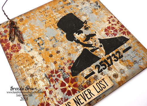
I have used a number of stencils with the DecoArt media acrylics and just one bit of stamping - check out the brand new Andy Skinner Textures set from Stampendous. You can get some wonderful mixed media layers for a background using them with some distressed layers of paint inbetween - check out the Tando blog to see how I created them.


The wonderful gentleman is another Andy stencil used with black modeling paste and this gives such a powerful contrast to the background.


A few embellishments and it's done.


I hope you can pop over to the Tando blog to see what other lovely projects have been posted on this theme and perhaps leave a little love.


Thanks for stopping by.

hugs Brenda xxx


Updated -- copied over from the Tando blog

I began by painting raw sienna and gold media acrylic paints on the substrate and then used black acrylic through an Andy Skinner stencil.


I love this technique of creating distressed painty layers - I painted titan buff onto the card and then rubbed it onto the board - it covers some of the background and some of the stenciling ....


... and so the mottled layering begins.


 Why not mix your own colours too? Having used the black I added some vermillion and created this dark brown and stencilled the dots.


Not wanting to waste the bit left over I mixed it with pyrrole red to create this lovely burgundy shade that I used with the Tando mini cogs stencil.


A little bit of stamping and a little more monoprinted titan buff and I'm happy with the background.


But I haven't finished with the stencils just yet. I took the steampunk one by Andy and with black modeling paste created the focal image .....


... and finished with a quote and some embellishments suspended from a rusty wire hanging.


I hope you have fun with your stencils this week.