So it's the third of March and we're celebrating our third birthday at A Vintage Journey and for this special challenge I have created something completely different. Our theme is called 'All Aboard' which leaves it completely open for entries and Creative Guide samples.
At the beginning of the new year I decided I wanted to do more 'art' and what I really mean is looking at my mixed media style and extending it, I needed to do some research and try to create some abstract paintings, which is where I really began my artistic learning back at teacher training college all those years ago. So I'm getting into 2017 with some abstract canvases - yes hopefully there will be some more to see how I get on - but this is the first. I'm looking to soar and fly high and enjoy this new part of my artistic journey.
At the beginning of the new year I decided I wanted to do more 'art' and what I really mean is looking at my mixed media style and extending it, I needed to do some research and try to create some abstract paintings, which is where I really began my artistic learning back at teacher training college all those years ago. So I'm getting into 2017 with some abstract canvases - yes hopefully there will be some more to see how I get on - but this is the first. I'm looking to soar and fly high and enjoy this new part of my artistic journey.
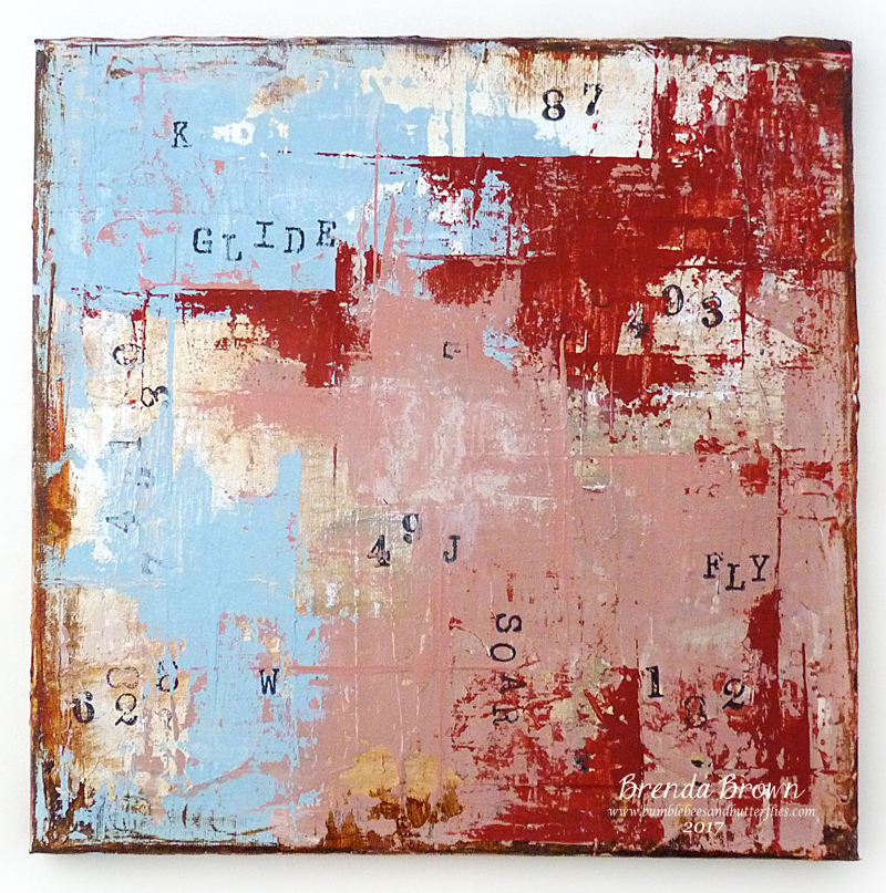
- Layers of gesso applied with a palette knife and dried between each layer.

- Rub with a wet wipe and brush some thin layers of paint over the canvas and when dry brayer over white to touch the high points of the textured gesso.

- Rub with a wet wipe and brush some thin layers of paint over the canvas and when dry brayer over white to touch the high points of the textured gesso.
- Rub some brown paint around the edges with a cloth.


- Stamp numbers randomly using permanent black ink.


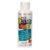
- Now here's where I went 'off piste' and picked up the DecoArt chalky finish paint and using a palette knife scrape two different colours randomly on the canvas.. (I mixed the vintage rose colour using smitten, relic, whisper and cameo).


- Stamp again, this time use letters randomly and permanent black ink. In fact add some words if you like the look.


- Using the a palette knife again apply another colour still leaving previous layers showing through. I chose the cameo.

- At this point I was unhappy with the serene blue so I had another go with that colour and the palette knife - notice the straight lines appearing in these top layers and I remixed some pink too to lighten up some areas.

- Finally I mixed some whisper. and rustic to highlight a few spaces.


- At this point I was unhappy with the serene blue so I had another go with that colour and the palette knife - notice the straight lines appearing in these top layers and I remixed some pink too to lighten up some areas.

- Finally I mixed some whisper. and rustic to highlight a few spaces.

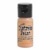
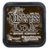
- When completely dry I rubbed coffee archival ink round the edges.


Here's the colour inspiration I found on my Pinterest 'colour palette' board.

So there we are, I'm not 'unhappy' with this 20 x 20 cm canvas but I can see I have lots to learn. I'm just gonna run with it and see where my muse takes me when I get a chance to experiment.
So hopefully you will be able to pop over to the AVJ challenge blog to see what else there is for your delight and certainly the Creative Guides have lined up some very magical creations and maybe you will share you art with us too. You never know you might win the £20 voucher being donated by Country View Crafts this month.
Take care and listen to your heArt.
hugs Brenda xxx
So hopefully you will be able to pop over to the AVJ challenge blog to see what else there is for your delight and certainly the Creative Guides have lined up some very magical creations and maybe you will share you art with us too. You never know you might win the £20 voucher being donated by Country View Crafts this month.
Take care and listen to your heArt.
hugs Brenda xxx