Welcome to May and a new challenge at Country View Crafts which is to use a stencil, but before I get to the project May is a very special month.
Right back to my project.
There is a story to these notebook covers - they began their life whilst I was demoing and teaching the gungy notebook (see post here) and I had a vision in my head of some shabby French design, pretty, feminine, with rusted elements on it. It's not often I have this sort of picture in my head but what a disaster, so much so I didn't even want to photograph the boards. I just left them till the next day and gave them a coat of gesso to see if I could transform them and I did.

This month alongside our Challenge, we are also running a Blog Hop with a Sizzix Big Shot Machine & Die Bundle as the prize. To enter, you must be a Follower of our Challenge Blog and Hop along to each of our Design Team Members Blogs and leave a comment. We will still be running our normal monthly challenge and those who link their Use A Stencil projects will also be entered into our £20 Voucher draw. The Winners will be picked at random in early June. So hop on over to Christine's 1st Project - Use A Stencil and follow the trail to all the blogs. If you have arrived from hazel and are following the links I have added a link for you to get to Corrie who follows me or you can get to any others on the list.
Brenda (me)
Right back to my project.
There is a story to these notebook covers - they began their life whilst I was demoing and teaching the gungy notebook (see post here) and I had a vision in my head of some shabby French design, pretty, feminine, with rusted elements on it. It's not often I have this sort of picture in my head but what a disaster, so much so I didn't even want to photograph the boards. I just left them till the next day and gave them a coat of gesso to see if I could transform them and I did.
These are the boards after the coat of gesso and they still look dirty and not at all what I wanted, the only good thing is that some of Andy's mega crackle still showed through almost like crocodile skin.

Out came the titanium white paint and I daubed, spritzed and dripped layers and soon the murky layer was fading into the background and I began to like the shabbier look. At this point I just gave it a coat of matte medium to seal it.

I added a very watery wash of cadmium red hue and raw umber mixed just around the edges and splattered with the red and brown separately. I thought I had finished them by sanding the edges and blending on
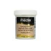
ground espresso DI but then decided to stamp one of Andy's texture stamps inked in blue violet archival and add some stenciling using Decoart's
white crackle paste.

Now we've got more of that shabby look I was trying to achieve. The stencil with white cracks brought the boards to life and at last I felt I could add the embellishments.

The Eiffel tower and fleur de lys are wooden pieces and originally I gave them the painted rusted look but they that was too overpowering for the design and composition so I gave then a coat of white crackle paste which was too thin so when it was dry I painted on weathered wood, gave it a blast of the heat gun and then added the white crackle paste again. Yay, fabulous crackle and seen more clearly with a light wash of transparent red iron oxide, quinacridone red and paynes grey which has given it that mauve tinge.

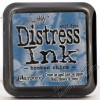
The frame and wooden letter pieces were given my rusty paint layers and then I painted on some transparent crackle paint to the frame and when dry rubbed in some raw umber antiquing cream. I let that sit for a while then rubbed some of it off with a babywipe, sanded the edges and blended in ground espresso distress ink.

I wanted something for inside the frame so I got out my vintage images box and found this printed French postcard which fitted perfectly.

I found the flower already made up from a spotty patterned paper and added white crackle paste to shabby it. The border was also in my bits box so I gave it the same painted layers as the spine and sanded it to distress it. The bow was made from a spare piece already coloured with distress inks.

These random pieces are from the chevron frameworks die cut in acrylic packaging, they were actually on the floor discarded from another 'playtime', once I had added red pepper alcohol ink they found a place on the front cover with the other embellishments.

The spine is made of dry wall tape, I painted it with a mix of red cadmium hue and quinacridone magenta and then blended red iron oxide and raw umber over it. The texture is one of those texture stamps by Andy Skinner and the final layer was a random wash of paynes grey.

And so it came together ....

... I like the back cover just as it is with the stencilling providing texture, depth and interest ....


Thanks for stopping by and taking a look. Perhaps you will join us at Country View Challenges but even if you don't I'd recommend you pop over to the blog to see what amazing inspiration has come from the rest of the team and also take your chance at winning the Sizzix bundle by joining in the Blog Hop. Good luck.
Take care and have a great weekend.
hugs Brenda xxx