Monday, 11 April 2016

Grungy Notebook Covers


These grungy notebook covers have been made Andy Skinner style using his mega crackle technique. I made them for a workshop I taught recently.


Front and back covers are cut from greyboard and the spine was made of dry wall tape ....


... the layered rusty greyboard and card cogs were given both textured and flat rusting techniques ....


... as was the on the edge die ....


 I was able to attend Andy's Mixology retreat last November where he made something similar and I wanted to recreate it with supplies of my own but still using the decoart media paints that are such a staple part of my creative diet.


Here are two of the books finished by workshop attendees-

Joan and ....


Jane of Jane's Journal.

I hope you have a good week.

hugs Brenda xxx


Friday, 8 April 2016

Another shabby canvas board birthday card

Hi, it's my turn to post a project over at the Country View Crafts project blog and I am sharing another birthday card canvas board in a shabby timeworn design. I made this one especially for my sis who had her birthday recently.


Do you remember me making these antique enamelled number plates last year - please find the post and tutorial here if you missed it, but I found one in a box and knew I could create a design around it.


If you'd like to find out more then please pop over to the Country View Project Blog to see more details.

For now enjoy your creative time and listen to your heART.

hugs Brenda xxx


Update - copied over from CVC

Hi it's Brenda here and I am sharing a birthday canvas board card with you today. Making these for special birthdays this year has become a bit of a passion at the moment and I think this is my fourth or fifth one. Anyway it went to someone very special I can tell you that.


I started with a 5 x 7 canvas board and decoart primary magenta mister, water spritzer and titan buff media acrylic. Having spritzed and dripped, dabbed with kitchen roll and dried the first layer of the background was very soft and pastel in tone.


I then stamped and clear heat embossed to create a resist effect before the next layers of colour were laid down.


Then I used one of the new Tim Holtz mini stencils and applied decoart modelling paste to create more texture.


I left this to dry (while I had lunch!) and came back to add the next layers. I sprayed tiny amounts of the primary magenta mister with the white shimmer mister and added a little titan buff into the mix, spritzed it all with water and let the combination of colours blend and drip and to create a more mottle effect I dabbed lots off with a piece of kitchen roll.This was left to dry again whilst I got the embellishments together. A chipboard frame had been covered with gesso and also painted with white crackle paint; I found one of my antique enamelled number plates I had made for a CVC challenge last year which you can find here with a tutorial if you missed it and I die-cut a couple of the 'wildflowers' from one of the new Tim Holtz sets of thinlits using a piece of left over rusted card. A black shabby bow, an artful arrow and some natural foliage more or less finished it off.


I used bought flowers and just added some touches of gesso to the pink ones but 'rusted' what were lilac ones by also adding the gesso and then I made a spray of burnt umber media acrylic and when dry added some touches of quinacridone gold.


Now back to the background and taking scattered straw distress ink I rubbed some over with the blending tool. To take the ink away from the embossed surfaces I used a piece of kitchen roll but oh no - help - the modelling paste was rubbing off and looking horrendous. The only thing I could do was keep rubbing to see what happened. Well -  happy accident? I think so as it all rubbed of to reveal the stencilled design underneath. Not wishing to push my luck I left it it as it was.


Here you can see the embossed resist of the stamped flowers that look beautifully subtle in the background and also the much more prominent resist area of the stencilled design.


 The enamelled number was mounted over some chipboard and nestled beautifully into the frame ....


.... and the rusty wildflowers peaked their heads above the more natural foliage and became a fabulous aged and worn addition to the unison of timeworn and contemporary elements.


The addition of the Tim Holtz easel die-cut enables this to stand on display on it's own or with a collection of birthday cards.


So there we have a pretty shabby vintage design for you. I hope you have enjoyed scrolling through ....


.... thank you for stopping by.

Tuesday, 5 April 2016

Masculine cogs card

I had a play recently with bister sprays on embossing folders and came out with a couple of backgrounds suitable for cards. You can see one of them - Celebrate Spring' here.


This one has been dipped in a little frayed burlap distress ink as well to create some additional interest.


I die cut the birthday wishes using two different sets of Tim's thinlits and I had these wooden cogs I had rusted up ages ago.
 

The stamped vintage man was in my box of bits and with some distress ink painting ......

 
..... so it all came together.


Another card for my box and a great one for some of those men I have to buy for.

Thanks for stopping by and thank you also if you leave a comment for me, I so appreciate them and read every one.

hugs Brenda xxx

Friday, 1 April 2016

Spring at Country View Crafts #1

Yay Spring has sprung and this is the second of my posts with that theme today and this one is for the Country View Challenge called Spring. If you missed the earlier one which is my sample for A Vintage Journey, then scroll back one when you've finished here or click the link
.
This time I have a canvas board for you made with DecoArt products.


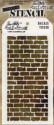
Using one of my 5 x 7 canvas boards I created texture using decoart white modeling paste and a Tim's bricked stencil and left it to dry.
Whist it was doing so I began thinking about the colours I would use.
I love collecting images on Pinterest and have a colour palette board so I looked for colours to use and these looked perfect especially as though they have a slight vintage hue to them.

http://www.hillcitybride.com/2012/04/the-perfect-palatte/

I die-cut the window and window box from mount board and set about creating crackle using the decoart white crackle paste. I began by giving the surface a coat of matte medium and a thin coat of the crackle paste hoping for a fine crackle to appear. You can see I did get some in places but maybe I should have painted it a little thicker to get more. I rubbed in sap green and titanium white paint and rubbed it away with a babywipe, then I sanded it and blended in ground espresso DI.


Next I painted a piece of card using media acrylic paints ....


... and stamped three butterflies using vermillion archival ink and cut them out. You will see though that I only used one in the end.


Then I continued with the background and used a collection of media paints to daub, spritz with water and drip until I was happy with the result.


 I even used a fine brush and added some vintage photo along the gaps in the bricks.


To finish it off I wiped on some transparent crackle glaze and left it to dry. At this point as it was such a beautiful Easter Friday we went for a long walk with the family on Ash Ranges.


When I got back the crackle glaze had dried so I rubbed in English Red Oxide antiquing cream, let it dry a bit and rubbed over with a damp babywipe to leave the cracks showing through.


I must have either not laid enough down in some places or overworked it as some of the areas didn't crackle at all. The result is a shiny surface where the glaze is so I gave the whole surface a coat of matte varnish.


 Now to collect and alter the embellishments - the single butterfly


A word band painted and most of it rubbed away to leave coloured lettering and some die-cut birds.


Some spring greenery and chloe stem ....


.... and an old prima flower that got a few spritzes of misters.


You can just make out the checked pattern paper that the flower was made out of.


 And everything collected together that I thought I would use. Can you see a snippet of wallflower stash paper behind the windows?


This is what it looked like.


The flower centre was originally a pear gem, it still is but I used the paints to colour it up.


The butterfly perched on the window - is he waiting to fly after the birds?


I hope you like my ode to Spring, I for one are certainly looking forward to the warmer weather.


Have a good April, time to get those gardens cleared and ready for the summer bedding. In the times you are unable to get out why not get creating and join us for the Spring challenge? You never know you might be the next winner of a £20 voucher from Country View Crafts or one of our top 3, but please pop over to the challenge blog to see our new teamies and all the inspiration we have for you.

Take care and listen to your heART.

hugs Brenda xxxxx


DecoArt products and other supplies I have used are available at Country View Crafts