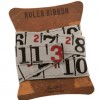
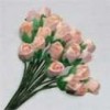
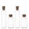
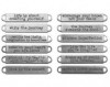
Welcome everyone - today I am sharing a project over at Country View Crafts Project Blog. I recently bought myself some small 5 x 7 inch canvas boards and have been enjoying working on this size .... so much so I have decided I will make these as little birthday card gifts for my friends this year and this is the first.
These are my teaser photos (click on them and they will enlarge further) and I'm hoping you will pop over to see the finished article and further details as to how I put it together.

There's a shabby mixed media background and lots of flowers and embellishments.

Thanks for stopping by. I am looking forward to the weekend as Tim is in town - well Birmingham actually. He is here to attend the Stitches trade fair and is doing workshops on the saturday and guess who has been lucky enough to get a place? Yay roll on Saturday and then I will hopefully get to see him demo over the next couple of days. Andy will also be there with the new DecoArt products and his own stamps and stencils so I will be able to go and chat to him too.

Take care and live in the moment.
hugs Brenda xxx
Update - copied over from CVC
Update - copied over from CVC
I have a couple of friends birthdays coming up so I thought I would make a different and more special 'card' for their happy day. I don't know about you but I put a lot of effort into making friends cards so why not make one that they can actually keep rather than throw or put sway after the big day. This was to be a wall hanging card which at the end changed my mind and I will add Tim's mini easel on the back so that will definitely mean they can keep it out on their shelf for longer.

I started with a 5 x 7 inch canvas board and layered it with gesso using a brush, palette knife and plastic card to add texture and coverage.


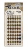
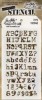
When dry I added some text texture using Tim's typo stencil and DecoArt modeling paste and when that was dry I used his harlequin stencil and some glassy gel from my supplies.

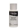
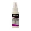
I felt a shabby colour palette would be popular with one of my friends so chose titanium white, titan buff, green gold, hansa yellow, sap green, prussian blue and quinacridone red media fluid acrylics (see shop list below) and the white shimmer mister to mix up the soft palette I wanted. Mixing the greens, cream, white and blue I created watery colours and let them drip and misted them with water to get the mottled effects.

The board then went through a whole process of me experimenting with layers until I was finally happy with the results .... adding more drips of paint and drying them ....

.... adding text stamping using olive archival ink ....

.... spritzing white paint with the shimmer mister and drying it ......

.... adding some brown distress inks to create shadows round the letters .....

.... spritzing the distress ink to create more drippage ....

.... taking out some of the brown and adding in more of the green because I thought it took away from the shabby feel I was trying to create ....

... and then spritzing with the white mister again and using a piece of cut and dry with white gesso and rubbing over the raised letters to bring them up whiter.

Now feeling happy with the background I set about collecting the embellishments. Paper flowers, a wooden frame, a metal wing, a metal butterfly all painted with gesso. A word band painted with bundled sage distress paint and before it was completely dry I wiped across the surface leaving the lettering slightly green. Lace, leaves, cheesecloth and other little bits (and more came later).

Some close ups of the finished piece - a wordband with some lace and tiny flowers ......


.... I finished by dabbing over some glossy accents and adding some glitter glass for added sparkle but as always it is very difficult to photograph .....

..... and here is a mini bottle I added that had been coated in gesso then decoart white crackle paste and when dry a little bundled sage distress ink rubbed on.

I hope you like my birthday board - I was going to add Tim's mini easel on the back but my Big Shot has had to go back to Sizzix to be looked at, but I will cut one from white mountboard and add to the back then it can easily stand on a shelf.

There is still time to take part in our CVC challenge of make your own backgrounds and maybe I have inspired you to have a go at this shabby mixed media style.
Enjoy the rest of the week into the weekend.
hugs Brenda xxx

There is still time to take part in our CVC challenge of make your own backgrounds and maybe I have inspired you to have a go at this shabby mixed media style.
Enjoy the rest of the week into the weekend.
hugs Brenda xxx