Monday, 15 February 2016

Wanderlust 2016

At last I'm underway at Wanderlust 2016 and sharing my first journal pages. I've decided to make my own journal so I can change the substrates when it is appropriate, so for these two I am using Daler and Rowney mixed media paper which is a good weight at 250 gms. Obviously as this is a current on-line workshop I won't be showing you the techniques as courtesy to Kasia and Jamie who are organising it, but if you are interested in joining the details can be found here.
 

In the first video Kasia shares an exploration of how she approaches her journalling taking us through steps and techniques she uses and encouraging us to try out new ideas and products. My finished pages are nothing like hers really and at times I have gone completely off piste but I am happy with this first outcome.


Along the way Kasia also encouraged us to think of one word that represents us at the moment and as I was tearing up some dictionary paper to use three words just appeared - Effort, Collaboration and Collective, so I have used the first two on my pages and you can see the text that is still showing through in the depths of the layers. What is also special is that the pages I use are from a dictionary that I bought second hand when I was at college training to be a teacher. I feel I am adding another part of me and my life to my art.


I have used decoart media acrylic paints, gesso, cosmic shimmer/distress stains/colour wash sprays and white ink ....


... and Tim's typo stencil with ground espresso DI.


The chipboard pieces give the focal points and I chose to use a bird and a star as they represent me flying free with these classes and shining brightly with self-determination, having time to explore without the constraints of other crafty expectations and commitments, giving myself time and permission to work with spontaneity, lack of inhibition and thinking outside of the box.

The flourished line and the frame also represent that new learning is forever on-going like a continuous line that never ends as is the unbroken circle that goes on for ever.


The B is me.


I don't often add my own journalling to pages but have added six of my own quotes that just came to me as I sat and thought about my two words. They read - 
Giving up is not an option.
I always endeavour to do my best.
The intention is to be the best I can.
In a partnership you achieve more.
To work with others in harmony.
Participate, co-operate and associate.
I look at these sayings in retrospect and really wonder where they came from!!!!


This has been an enlightening first step along the Wanderlust journey and made me feel very happy that I am and can give some time to me for developing my art.


Thanks for reading and sharing in this new adventure.

hugs Brenda xxx

Thursday, 11 February 2016

Valentine Background

I am taking the opportunity with my background #2 DT sample for Country View Challenges to make a Valentine card for my hubby.


I began with ivory smooth cardstock and stamped the Valentine words from Tim's Valentine Silhouettes set using antique linen distress paint and heat dried it.


Next I took festive berries and fired brick distress inks and blended them across the card and over the paint.


Take a damp cloth and gently wipe over the surface lightly to remove the ink from the painted surfaces and then spritz with water to activate the ink and allow it blend and create distressing. You can see the water marks in the photo below.


Then scuff, distress and blend ground espresso ink around the edges and ... eh voila the background is finished.

 
Now let's see what I did to finish the card.
Using the same set of stamps I stamped the hearts in antique linen and fired brick, cutting some out not knowing which ones I wanted to use at this point. I needed something brown so I found a scrap of card that had been altered to look like rust and I stamped the set of hearts again in clear embossing powder and clear embossed.


With the rust one I added a red and an antique linen one stamping them all with text using Tim's ledger set.


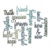
Using the friendship words thinlits I die-cut the words I wanted found a black star and a customer fastener in which I put a clock face.


With a piece of coloured hessian the design now came together.


Fairly simple but quite effective I think.


I'm now ready with hubbies card for Sunday and looking forward to a quiet day.


I see Frilly and Funkie have a 'Love is in the Air' challenge so I am entering their challenge again this month.

Thanks for stopping by again today, I hope you have been able to take a look at the new backgrounds challenge at CVC and maybe you have even entered.
Enjoy the rest of the week and happy Valentines Day to you all.

hugs Brenda xxx

All you need is love.......
 But a little chocolate now and then doesn't hurt.
Charles M. Schulz


Monday, 8 February 2016

Alternative Wildflower Spring

So excited when my Wildflower set of stamps by Tim Holtz dropped through the letterbox yesterday. I had to go out so didn't get to them till last night but I couldn't resist using one of these gorgeous silhouettes with some embossing powder and in sneaked my alphanumeric dies as well. I thought if Tim is 'mixing it up' this year it gives me a fabulous opportunity to look deeper in my boxes and find some my older supplies and think about the early techniques too.
So.............


1. I started with my background of antique linen, bundled sage, tattered rose and stormy skies distress inks on my craft sheet, spritzed them with water and did the dip and dry technique to create a watercolour background.

2. I then lightly stamped with watering can archival ink - don't ask me why that colour, I was just playing and used whatever came into my head.


3. I then stamped again with embossing ink and used the black super fine detail embossing powder.

4. And finished with some weathered white embossed images on the top.

Next came out my alphanumeric dies and I created my own block word using blue and black papers. You can see I kept the middles of the blue P and R to fill the holes after I had inserted the the letters.


Spring and black seemed very 'alternative' to me (hence the title) so I decided to get out the black seam binding and make a shabby ribbon and found a 'wonderful' dark muse token to pin to it. I also punched one of Tim's butterflies from a scrap of a practice background and ran it through the 'cracked' embossing folder then dripped some watery black distress ink through it but it seeped into the whole butterfly. Hmmm silly me of course it needed a waterproof backing so I did no more than turn the butterfly over, daub it with tattered rose distress paint and then ran the black ink through it - I needed to keep it light in tone otherwise it would have detracted from the style. I also used Tim's 'birds in flight' strip die for the little bluebird.


Gosh I have 'mixed it up' and really quite like the effects.
 

I noticed my friend Jenny's gorgeous embossed card for her Frilly and Funkie DT sample so I am popping over to link this up to their 'Enjoy your Embossing' challenge, I have used both heat and dry embossing on this card so it fits perfectly. Gosh it feels so good to do that as I haven't entered a challenge for such a long time.

Thanks for stopping by.

hugs Brenda xxx


Friday, 5 February 2016

We are going industrial at AVJ

P I have loved putting together my February CG sample for Tracy's 'Industrial' challenge at AVJ. In thinking about the terminology and meaning of industry we think of factories with rising chimney stacks exuding steam and smoke, metals, mechanical and automated machines, blast furnaces, manufacturing industries, car plants and so on. But I also like decayed metals, particularly rusty ones so I turned to Tim's faux, riveted metal effect, his remnant rub background and idea-ology combined with DecoArt media acrylic paints and mediums to produce this Curio Box.


Easter is approaching and I had bought a papier-machie egg from Hobbycraft last week and decided to use it. Having found an old Ipod box in my drawer of alterable items everything started to come together in my head but the egg was going to be difficult to stick it in the box so I cut it in half using a craft hacksaw.
The egg was first covered in foil tape to give it a good covering of silver and then I cut and marked pieces of Tim's foil sheets and covered over to give it a stronger layer. Next I used media acrylic paints coating thickly, semi drying between each layer and wiping back. I used black. prussian blue, burnt umber with burnt sienna mix, and quinacridone gold. But I didn't get the effects I wanted as when I rubbed the paint away between each layer I had a stark contrast between the silver and the coloured paints.

 
So next I added some alcohol inks but it looked too false. Nothing to do but change it completely then..... I added some random and thin amounts of sand paste and dried then some mid grey and paynes grey paints. I blended some black round the edges, dried it and then added a paynes grey wash before quinacridone gold again. Ok it's not like Tim's 'Heart and Soul' heart which is where the inspiration came from but I quite like how it has turned out.

 
So onto the box. I gave it a coat of black gesso inside and out then did Andy's mega crackle technique on the outside with the decoart weathered wood and crackle paint so I painted the inside of the box with white gesso to lighten the whole thing. The mega crackle worked brilliantly with the large black cracks.
 When it was dry I gave it a coat of matte varnish and then a watery wash of prussian blue and quinacridone gold before adding some remnant rubs.


For the background behind the egg I revisited Tim's January tag of 2014 but changed it a little and used distress sprays and remnant rubs.


The butterfly is one of Tim's duo set,  I feel a tutorial coming on so keep a watch out on the Destination Inspiration posts next month but you can see it is well rusted and has that industrial feel to it.


The word curio is made up of Tim's alphabet blocks with the letter shapes given  a very light dry brushed layer of gesso and then a wash of quinacridone gold acrylic paint. I dabbed vintage photo distress paint over the arrow and when dry brushed a little treasure copper on it.


Finally I had almost everything made to put it together. As always my eclectic mind gathered more bits along the way and I added some natural materials, moss and husk hair to provide more interest. You can also see I found a rusty spring and finished off a little bottle that had been part painted. You can also just make out a tiny star in the moss which was punched from Tim's punch using left over card I had altered to look like rusty metal and glued it to a memo pin.


I love the butterfly adhered to the crown of the egg ......


.... and the blocks glued to the top of the box.


Here you can see how the egg and butterfly protrude from the front of the box - had to pack it out with chipboard first otherwise they would have disappeared inside.


I think the mix of industrial and natural materials have worked really well together and have put me in the mood for Spring.


Now it's finished I am very happy with the outcome and this has become one of those rare pieces that I would like to display in my house and I know I will use it for my sideboard Easter


I hope you can find some time to pop over to the AVJ challenge blog to take a look at all the other inspirational pieces mage by the very talented Creative Guides and if you take a shot at entering you could be in with a chance of winning a £20 shop voucher from Country View Crafts or being one of our Pinworthy Mentions.


I am adding my industrial butterfly on the egg to the Frilly and Funkie challenge 'enjoy your embossing'

Thanks for stopping by and have a wonderful weekend.

hugs Brenda xxx


Create your own visual style... let it be unique for yourself and yet identifiable for others.

Orson Welles