Saturday, 22 August 2015

Microglaze resist tag 1

Capture Beautiful Dreams


This is one of the follow up tags from the tutorial I did using the distress microglaze as a resist - if you missed the tutorial you can find it HERE.
You may remember the tag began this life as a mop up from my spare box of bits ...


... and had the microglaze treatment through a stencil.


 It looked like this before I blended more distress inks over it.


To make up the tag I collected elements I wanted to put together, but as always they changed and got added to as you will see in the finished photo.


I also stenciled through the latticework stencil with iced spruce and tea dye before using a small splatter stamp with picket fence distress paint. It was then ready to make up the design.


I changed the mini tag and added the numbers and a star, these helped complete the balance and interest of the final layout.


The sentiment was made up using chit chat stickers and I added a stamped pen nib too.


I love this picture from the photo booth collection. just a ticket a mini paperclip again add more interest, texture and depth.


With the film strip and numbers and a piece from a framework die the composition and design was complete.


There's tag 2 coming up in a couple of days so keep your eyes peeled to see how I used another of the tag collection from the tutorial.

Have a great weekend and thanks for stopping by.

hugs Brenda xxx


Thursday, 20 August 2015

Destinations scrapping

Just a quickie from me today as I will be travelling home from holiday. Do you remember the album cover for the destinations challenge at AVJ and I said I was determined to make memory pages - well I have made a start and I have scrapped one using a photo and memorabilia from our weekend in Wales in July.


Using Tim Holtz correspondence papers and some of his chit-chat stickers, remnant rubs and cut ephemera I have now begun to record the places we visited.


It was a fabulous weekend meeting up with cousins from Cambridgeshire and cousins and their families in Pembrokeshire.


A simple page but I am pleased I have made a start.

Back to normal soon.

hugs Brenda xxx


Tuesday, 18 August 2015

Distress micro glaze resist tutorial

I've enjoyed finding out how the distress micro glaze works recently and suddenly just wondered if it could be used as a resist - and guess what? It can.

It took me some experimenting to get the effects I wanted and several tags ended up in the bin but I finally got something I liked

To begin I took a mop up tag .....


... and one of the round mini blenders (which fits nicely into the micro glaze pot) and pounced it lightly in the micro glaze tub and then pounced it through a stencil. I followed Tim's instructions and gently rubbed it with my fingers (whilst the stencil is still in place) and when that felt as though it had rubbed in I took the stencil away and gently rubbed a paper towel over it.


 I then took some distress inks and blended them over the tag and you can see it partially worked. We have got a distressed imprint of the stencil image in some parts but the lighter area on the left side looks as though the micro glaze got rubbed away by the paper towel. I obviously hadn't rubbed it in well enough with my finger.

Here's a second mop up ......


.. with blended inks over it and this time it worked better but I think it was because of the large area exposed on the stencil.


And this is the third and you can just see on the photo below where I had rubbed on the micro glaze only this time I rubbed over it with a paper towel whilst the stencil was still in place and again gently after I took it off.


This time after I blended distress inks over it I got a much better impression and was really pleased with the result. If you look really closely on the lower part of the tag you can still see some of the distress from the first layer before the micro glaze was added.


So micro glaze seals distress inks so that they won't react with water again, it allows you to create more layers keeping the original design and colour underneath it. Tim has a great video on you tube which you should watch where he experiments with stamping and different types of paper/card.

Please let me know if you experiment with this technique and let me come and see your results and have fun. I'm off to finish these tags.

hugs Brenda xxx

Sunday, 16 August 2015

Altered double wooden frame

This is a small double frame that I used for a recent workshop at my local craft store, The Art of Craft. We focussed on making the frame look shabby and creating the front and back panels as mixed media layers using gesso, acrylic paints, die-cuts, stamps and distress inks, embellishing the front with some shabby flowers.


The outside panels were layered with a coat of gesso, brighter colours of acrylic paints, die cuts added and then everything brayered over with white paint before stamping with black archival ink and then dipping in victorian velvet and dried marigold distress inks and then lastly dipped in some watery white acrylic paint.

I needed to keep the inside fairly simple a) as it was a morning only workshop and we had to get all of this made in three hours and b) I wanted this to close flat so embellishing and texture was out of the question. I added some vintage photos that are free for downloading off the internet.


For the inside backgrounds for the photos I blended distress inks over white card, sponged some white acrylic through a stencil and then spritzed it with water and flicked some watery vintage photo Di over it before drying

I also splattered some white acrylic paint and vintage photo over the frame.


I left this frame at the shop for display and made another whilst demoing and teaching adding photos of my children when they were little when I got home..


I changed the colour scheme as it's always good to show workshop participants how they can make changes to their projects as they are creating them.


I took photos of the fronts of everyone's finished frames which are superb. You can see the similarities and differences in their finished designs.


They all enjoyed the session getting messy with all the layers they were adding and I loved teaching such enthusiastic and creative ladies. I'm already thinking about the autumn workshops and what to teach.


Have a great Sunday and thanks for stopping by.

hugs Brenda xxx


Thursday, 13 August 2015

A Visual Journey #32

Inspired by Wendy Vecchi

Following the fabulous day we had with Wendy Vecchi on the 2nd August in London I was so inspired by her style I just had to interpret it into some journal pages. I don't have too much of Wendy's products so I have incorporated stamps and stencils from Tim and other places to get the effects I wanted


Having painted gesso over the pages and let it dry I dipped them in spun sugar, dried marigold, tattered rose and aged mahogany distress paints.


Then dipped them in a small amount of hickory smoke and gathered twigs distress inks.....


.... and then stamped one of Tim's stamps from the distress damask set in black archival, covered with black embossing powder and heat set. Used a stencil and vintage photo DI and Tim's chevron stencil using victorian velvet and hickory smoke to create the top border (WV style).'


I stamped using Wendy's 'fashion style and art' set and coloured in with rusty hinge and ripe persimmon distress markers and painted it with a small brush and water. 


For the other page I stamped her dress form from a 'form of art' set onto an off cut left from another project and then blended abandoned coral and victorian velvet over edging with walnut stain. 


Stamping the base from one of Tim's stamps and drawing a line up I was able to provide a stand for it. The sentiment is one of Wendy's.


Finally I added some text stamping in the background, stamped and cut spools (Tims), used a white posca pen to add some details on the stamped elements and a black posca to do faux stitching round the edges.


I really enjoyed making these pages, I'm not sure Wendy would consider them her style but it was she who inspired me to make them.


Thanks for stopping by today to share in my Visual Journey for 2015. My old altered book is really filling up and it's already amazing looking back over what I have created. If you have been following or joining in then I will add a linky again next month, it's just that it has been so busy over the summer I haven't had much time to visit or comment, but I am ,looking forward to getting back into that routine.

Enjoy the last few days of this week and look for inspiration all around you.

Take care.

hugs Brenda xxx

Start by doing what's necessary; then do what's possible; and suddenly you are doing the impossible.
Francis of Assisi


Monday, 10 August 2015

Here and Now tag with background tutorial

I am posting over at the Country View Crafts project Blog today and I am in full summer mode, maybe it's something to do with the challenge that is running over at Country View Challenges as well, it's really motivated me to be extra summery.
So here's my tempter for you and I hope you will be able to pop over and see my tag in more detail.


I expect many people have children off on school holidays and are even away enjoying a break, hopefully in sunshine. Wherever you are and whatever you are doing have a great week and maybe some special creative time as well.

Thanks for stopping by.

hugs Brenda xxx

The sea, once it casts its spell, holds one in its net of wonder forever.
Jacques Yves Cousteau


Updated - Details copied over from CVC
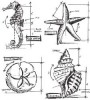
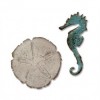
My tag today uses both the Tim Holtz nautical stamps and his mini sand and sea movers and shapers.


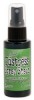
I took a tag that had been used to wipe up some gesso from a journal page and you might just see the textured impression it left behind. Over that I dipped the tag in mowed lawn and salty ocean distress sprays that were also left over from the greenery (see below).  I don't like to waste anything you know.


The colours were perfect for what I had in my head except I felt some white would make it more foamy for the sea so I gave the whole tag a covering of the distress micro glaze before dipping it into some watery picket fence distress paint. I got another layer creating more depth and although some of the paint stayed white, some of it mixed with the colour underneath - I guess I hadn't smoothed quite enough on in some areas. But I liked the look it produced.


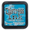
The tag looked a little too green for my liking so I now dipped it in some mermaid lagoon distress ink which created yet another layer.


Next I gathered the elements together to make up the design. I had sprayed the greenery in the mowed lawn and salty ocean before dipping the tag in it (see above).


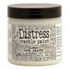
The seahorses were inked in different blues and then given a layer of rock candy crackle paint. When dry and the crackles had appeared I inked over them and gave then a splash of picket fence distress paint to make them look foamy too.


Once I had finished I found the greenery far too bright in contrast with the rest of the tag so I dabbed some of the picket fence distress paint on it as well. That helped it to blend in better.


I hope you are having some summer fun, thanks for taking peek at my tag today.

hugs Brenda xxx