Monday, 4 May 2015

Small book London themed

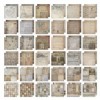
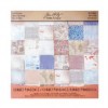
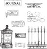
When I went to meet Paula Cheney in Windsor last month I took her a little gift I had made. Knowing she was spending a few days in London and a few in Paris I used Tim's Correspondence and French Industrial papers to make her a little scrapbook cum journal to keep some of her mementoes in.


This is my contribution over at the Country View Crafts Project blog today and there are more photos for you to see over there.


I hope you have a great week.


hugs Brenda xxx


Products used in making the book


Friday, 1 May 2015

Spring Coloured Butterfly for AVJ

Foreword 15th April - here I am sitting looking out into my back garden pondering what I can make for this new challenge chosen by the lovely Astrid - Spring Colours. It is a sunny Spring day, the sun is shining, the birds are visiting the feeders and there is an odd colourful butterfly or two winging their way around the shrubs and trees. The pretty pink blossom from the flowering cherry tree is just finishing and the white blossom on the plum tree has just emerged. In the garden next door I can see yellow button and yellow forsythia shrubs and a tub of orange flowers ...... mmm could this be my Spring colour palette?


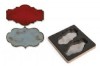
Taking a piece of black foamboard I cut Tim's cameo frame. When I did this I found the edging to the frame came away and I could place the main part of the frame in the outside piece leaving a gap between them - so this became my substrate to work with. I sealed both pieces with DecoArt black gesso.
On the inner piece I painted rock candy clear crackle paint and on the outer frame I rubbed some candle wax and dabbed picket fence distress paint over it.


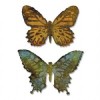
 Whilst the frames were drying I die-cut Tim's layered butterfly and ran it through the embossing folder. I wanted to play more with tbe mixed media butterfly effects I had achieved on my Destination Inspiration collection of three - see here. After choosing the colours I wanted to work with  - mustard seed, victorian velvet, spun sugar, picket fence and dried marigold (chosen from my ponderings above) I began by taking a box of oil pastels and colouring over the raised areas with white, creamy pink and yellow.


Next I spritzed the butterfly with water and daubed on mustard seed, victorian velvet, spun sugar, picket fence and dried marigold distress stains and heat dried it.


Lastly I splattered some ripe persimmon, abandoned coral and picked raspberry distress inks over and spritzed with water again, finishing with a paintbrush and touching in some of the colours to get the contrasts I wanted. I also inked the edges with walnut stain.


The inside frame dried with lots of lovely cracks. I firstly gave it a wash of picket fence distress stain wiping off the excess and then I daubed walnut stain and brushed corduroy stains over it and baked them in with a heat gun.


 When the outer frame was dry I heated it to warm the candle wax up and gently rubbed with some kitchen toll to reveal the black underneath and then I daubed both walnut stain and brushed corduaroy stains over this and baked them in.


The whole piece was finished with some embellishments and a backing which had been dipped in the ripe persimmon, abandoned coral and picked raspberry distress inks.


For the title I used Tim's big chat words


Rather different again from my usual and its one of those projects where the photos really don't do it justice - but I enjoyed the experimenting.

We would love to see you over at A Vintage Journey for this month's challenge and do pop over to see all the amazing inspirational projects from the very talented Creative Guides.

Enjoy your weekend whatever you have planned.

hugs Brenda xxxx


Thursday, 30 April 2015

Visual Journey #18

I began these pages with a light coat of white gesso and let them dry. I have Tim stamps UNUSED - oh boy who else does that? Buys new stamps then takes forever to use them? Not just me I hope!!!


Using the classics #11 I stamped two of them onto my pages and stamped two onto thin card. I also found a mask also UNUSED in my drawer, a crafter's workshop one called mini dragonfly harmony, so I squeezed some turquoise acrylic and added some white gesso and blended it over the mask using a piece of cut and dry foam. I then washed over some decoart quinacridone violet and used a wet babywipe to pull some of it off again. This was quite damp by now so I left it to dry and began the next two pages. (I often have two on the go at any one time).


The background needed more layers and textures but my mind is on today and excitement got the better of me - today is my travelling day - flying to California  - and the dragonfly dance reminds me of the whirl my brain is in trying to remember everything and getting things finished before I go. I set aside my two stamped pieces of card and began to rework the pages.


Mixing a watery wash of transparent yellow iron oxide on my craft mat I dipped the pages in it twice and dried them, then I took the Decoart turquoise shimmer mist and transferred some of it to a mini mister (one part turquoise and 4 parts water) and sprayed through one of Andy Skinners masks.


The two previous colours are transparent so I took the opaque carbon black and another Andy stencil to give me my words and focus which was when I decided the stamped head would fit in well relating to the hundred and one things to think about. But my head is really in California already, you can tell that by the stamps I added that relate to our destination.


I typed and printed the words I wanted to add .....


... including my feelings about why we are going -
'We are now travellers in California, having seen what we wanted to see, we now visit to make the most of what there is to see.'


We also go because we want to spend time in a place we call home from home with our friends Joni and Leo and take time to do some travelling, especially to spend a day with Terry and Steve having a lovely meal together and getting into some craft shops but  also to live the American way.


I will be on Face Book with updates so if you follow me there you will see some of what I see too.

I have some posts scheduled whilst I am away, so stay tuned and I shall continue to follow the journey of my fellow visual journey followers too.

Here is the link if you wish to share the collection and the linky is below for you to add your journal pages.


Take care and thanks for being part of my journeys.

hugs Brenda xxxx


Tuesday, 28 April 2015

Rusty Steele telephone - DecoArt techniques - Board 2

Ok, ok so I have given myself some artistic license here,  but did you know that the first early telephones were made of metal, but were switched to plastic at the start of WWII.  All phones thereafter were plastic.
This is board two in my DecoArt series for my workshop for Country View Crafts on the 6th June (details on my side bar). Participants won't actually be making these boards, they will be learning the techniques and then using them to alter a box. These are to show how the effects can be used in  different ways.


Again I have used the DecoArt media products for this technique which includes layers of the acrylic paints and one of the texture mediums and I have used Tim's mini movers and shapers telephone die to show the effects.


The ATC background has a paint technique I am calling 'camouflage chippy paint' and has a very weathered and mottled look to it. The numbers have been added with Tim's stencil and DecoArt modelling paste.


The cabinet card was cut from foamboard and given a coat of white gesso to begin with. I randomly splodged a watery wash of Traditions quinacridone gold over it and used the heat gun to dry it. Next I repeated that process with Traditions prussian blue hue and when dry painted on a coat of DecoArt weathered wood crackle. When that had fully dried I painted on a coat of titan buff and watched the crackles appear.

I wanted to continue the number theme so when the background was again dry I stamped the numbers from Tim's little labels set in black archival ink.


I adhered the ATC onto the cabinet card and 'painted' some matt medium round the edges and used a vintage photo distress marker to create some shadow all round.


The backing board was dipped in a mix of tea dye and pumice stone distress inks. I love how the paints and the inks complement each other so well.


I've got the last of my packing to organise today, my hair and nails will get done tomorrow and then Thursday we will be off to see our friends in California. It won't be long now Terry.

Enjoy the rest of the week.

hugs Brenda xxx


For once you have tasted flight you will walk the earth with your eyes turned skywards, for there you have been and there you will long to return.
Leonardo da Vinci


Sunday, 26 April 2015

April Tim Tag

I took inspiration from several different sources to create my Tim tag for this month - Tim's April post of course but also a couple of things on Pinterest caught my eye using heritage photos (see my Pinterest board Here).


I began by cutting the front of an an old book cover away from the pages to use as my base .....


.... and gathered the resources and materials I needed to put this together.


I chose to use different stamps to Tim as I don't yet own the beautiful flowers but I also wanted to use one of the photobooth images and chose this one to go with the saloon stamp.


I am definitely in USA mode (we fly Thursday - yay not long to wait now) and picked out the word adventure to use on my project. Looking through my other thinlits I noticed the holiday word set has wonderland in it and that I could cut off the piece I wanted to make up my sentiment ..... and so it started to come to life. Having cut the kraft card to size and cutting the slits in it as Tim shows us, I turned my card over and adhered a piece of red card so that it showed through the cut out word.


I stamped and watercoloured my chosen image using distress markers and a water brush using the Wild West stamp set.


I distressed the edges of the book cover and inked the edges, you can see it has this wonderful linen cover over it that distressed really well .....


.... and I also stamped the stars from the same stamp set, coloured a star with denim alcohol ink and added some star brads and rusty elements.


Finally I attached some rusty wire to two clips and clipped them at the top to make this into a little hanging.


I know this is not at all like the master's inspirational tag, but I am pleased with the way it worked out and it does use his techniques and a similar layout.


I shall be linking this to Tim's April tag post.

Thanks for stopping by, enjoy the rest of the weekend and have a great week ahead.

hugs Brenda xxx


We live in a wonderful world that is full of beauty, charm and adventure. There is no end to the adventures that we can have if only we seek them with our eyes open.
Jawaharlal Nehru

Thursday, 23 April 2015

Visual Journey #17

Here is my next instalment of journal pages and I am so pleased I began recording my visual journey of experiments and learning for this year.


The pages were prepared with a light coat of gesso and left to dry.
I chose four DecoArt acrylic colours - medium grey value 6, cobalt turquoise hue, viridian and phthalo green-blue. My choices were guided by some new washi tape I bought at Ally Pally (it's strange where inspiration comes from sometimes). Using a baby wipe and a little water I covered the pages in layers of each colour rubbing them on and off again in places.
When dry I used an old credit card to scrape some titanium white over the pages. I dried them well with my heat gun.


I wanted to do some painting to be included in the background so I used some Tim stamps - classics #2 -with black archival ink .....


.... and then using a selection of small brushes I painted them in using acrylic paints.


The colours I chose were - DecoArt phthalo green-yellow, transparent red iron oxide, transparent yellow iron oxide, sap green and translucent white.


Next came the new and some old washi/tissue tapes ...


... and a small text stamp using black soot distress ink.


Finally I die-cut the Eiffel tower and fleur de lys from Tim's bigz die using core'dinations paper and sanded them down and added explore moments from Tim's journey thinlits dies.


I also edged the words and die-cuts with a black soot distress marker.


I love the collage style, the new mix of colours and the overall effects - hope you do too.

Please come and join me with your journal pages and your visual journey, I'm loving seeing what you are doing.

If you would also like to share everyones work on your blog then locate the code below and add it to your blog post.


Enjoy the rest of the week.

hugs Brenda xxxx