Friday, 19 September 2014

Autumn colours for A Vintage Journey

Before we start I need to warn you this is a long post as I have included a step-by-step to create the background as well as explained how I made the embellishments. You might like to get a cuppa before we move on.

It’s the lovely Astrid’s turn to host the new challenge at A Vintage Journey and she has chosen the theme of autumn colours. This is how she describes it -
Who does not love the beautiful colours that Autumn brings? The oranges, muted deep reds and all the many different brown and green hues. Tim's Distress range should give you many choices. Make a project incorporating some of these colours, but don't forget this is a shabby vintage challenge, so no cute please!

I chose to make a canvas full of pumpkins and leaves to depict an autumnal theme.
P1180658
To begin with here’s how I created the background.
P1180565a
I started by daubing gesso over the canvas with a palette knife and laying some old dictionary paper in it. I spent a little while pressing the paper in to let the moisture seek through, after about 4 minutes I began to tear the paper away leaving some embedded into the gesso. I left this to dry overnight.
P1180566
The next day I smeared several of the green distress stains over it plus some antique linen. If you try this, make sure you dry the canvas and media between each layer.
P1180568
Next came some of the distress paints, smooched onto the craft mat, spritzed with water and then pounced in random places using a piece of kitchen roll.
P1180570
Out came the gesso again and this was also applied with kitchen roll.
P1180574
Now to add a bit of texture, just some small bits of frameworks at the moment, adhered with wet glue and a little gesso dabbed over parts of them with my finger.
P1180576
And now some stamping using black archival ink. OK are you still with me?
P1180581
Out came my favourite latticework stencil and I used some cut-n-dry foam to transfer more white gesso onto the canvas -  be warned using a palette knife will push it underneath and smudge it.
P1180584
Then some dipping with the greens and adding some yellow and finally some splatters with the brown – phew, hope you like it. This photo shows some of the details in close up.

Next came the elements to add.
P1180614
Three butterflies die-cut from Kraft Resist paper using Tim’s mini butterflies. I  dipped them in some walnut stain distress paint which acted as a resist then daubed barn door stain over them and some wildfire treasure gold.
P1180616
Three mini acorns die cut from card covered with distress inks and rock candy crackle paint.
P1180618
The picture wheel with a die-cut cog, added because I wanted something to reflect the shape of a cartwheel. I covered it with distress embossing powders and then some distress paint mixed with distress stain and as my friend Sharon said it looks as through it has been through the mud.
P1180619
Finally two types of pumpkins, pumpkin jack and the mini movers and shapers. The large one was textured using gesso through the speckles mask then layered with distress paints and distress stains. The smaller ones were cut from coredinations paper, sanded and dipped in some stains to create the colour changes for interest.
P1180645
To complete the look I added two 3D pumpkins and a mushroom I found in my drawer bought at Hobbycraft in the florist section and also the words were stamped from Tim’s Thankful Silhouettes die.

Well I did warn you it was going to be a long post, but I hope you have enjoyed looking at it. If you would like to know how I did the  leaves drop by A Vintage Journey on Monday morning where I will be doing a Destination Inspiration post and another step-by-step, but for now have fun with your autumn colours and come and join us in our new challenge.

Have a great weekend. I shall be at Ally Pally tomorrow if anyone else is going.

hugs Brenda xxxx

Wednesday, 17 September 2014

Nautical 2 for Country View Crafts

I booked myself onto a workshop at Pickwell Farm recently with the fabulous Andy Skinner. I have attended his classes before and love the wonderful textural and aged projects he makes, I wasn’t disappointed as we got to create an amazing altered book cover. The whole design reminded me of a shipwreck at the bottom of the sea with a compass and watery blue colours so I decided I would add some further embellishments to re-create that feel and use it as my second DT contribution for the ‘Nautical’ challenge at Country View Crafts.
P1180337
What do you think? Have I managed to fool your sense into thinking this looks like a porthole in the side of a sunken vessel with a haunting skull of a seaman laying half buried in the debris? What lies beyond the opening? What has been preserved in the salty waters and is there a bounty of treasure to be found?
P1180338
With respect to Andy I can’t tell you the processes used to make this industrial style textured cover  but I though you might enjoy some close-ups.
P1180332
The ship's compass lying rusted over the porthole ……
P1180333
P1180334
Crust shells lying motionless deep beneath the waves and beyond the shore …..
P1180343
The porthole cover riveted to the broken hull of the vessel with a length of rusty chain hanging round the edge ……
P1180351
We love to see all styles of art and craft at CVC and we hope you will join us with a ‘nautical’ project if you haven’t done already.
P1180345
This is the spine of the cover and ……
P1180336
the back, created in a completely different way as you can see.


At this point I would like to give a plug for a class I am teaching at Pickwell Farm on Saturday 18th October. We will be making two Christmas hangings using the Tim Holtz mini burlap panels. Why not come along if you are in the Southampton area and have a fun day.

Thanks for stopping by and taking a look at what I have made.

hugs Brenda xxx

Tuesday, 16 September 2014

Shabby French tag for CVC

I have a tag for Country View Crafts today made with a very quick distress ink background and the beautiful French Flight stamps and Framelits dies.
P1180530
Here’s a sneak peek to hopefully whet your appetite and if you would like to see more details please pop over to the CVC projects blog.

I also posted some information about my next workshop in Flitwick which you can find here. The fabulous Chris (My Corner of Heaven), who runs the CVC blogs, has designed the box and I have used some pretty but shabby vintage Basic Grey papers with it. The whole book box is made from scratch using card and mountboard so it will be a fun day in construction and creating. I would love to see you if you can make it.
P1180142a

Well it’s Tuesday and we’re nearly half way through another week, so I hope it is going well and that you are getting in some creative time. I will be back tomorrow with my second ‘Nautical’ piece for the CVC challenge.

Take care.

hugs Brenda xxx

Friday, 12 September 2014

The Voice of the Sea–Crafty Individuals

I am still playing with one layer stamping and prisma colours, but this time I added the quote as an extra layer. I think I am dreaming of an Indian Summer, although we have have had some gorgeous warm afternoons this week. Long may it continue, but have you noticed the evenings really drawing in?
P1180486web
I began with a tag and the wrinkle free distress technique.
P1180480web
and then started stamping images from CI-384 and CI-272. The lighthouse stamp is a collaged image so I wiped away some of the archival ink before stamping it. This gave me just the lighthouse and some of the gulls.
P1180483web
I then used Prisma pencils to colour in….
P1180492web
…. finishing off with a charm and ribbon.
P1180493web
Thanks for stopping by today, I really appreciate your visit.


Tomorrow I am going up to London with Ken, we want to see the flow of poppies at The Tower, they look amazing on all the photos, but like everything seeing them irl will be so much better.

Catch you later.

hugs Brenda xxxx

Thursday, 11 September 2014

One layer stamping

Just a quick post from me today.
I am teaching a workshop on one layer stamping in a couple of weeks time and making a couple of cards so I am playing with masking and layering stamps to get back into the swing of things.
P1180445web
An easy one to start me off using the fabulous Chemist set of stamps by Tim Holtz.
P1180446web
I am also experimenting with mixing Prismacolour and water colour pencils to se what effects I can achieve. Mmm starting to like what is happening with the colours, must try this out more.
P1180448web
I hope your week is going well. On Monday I had lunch with Nikki Acton from Addicted to Art and A Vintage Journey teamie, we also mooched around the shops in Camberley before having a coffee before we went home. Lovely to catch up with you Nikki.

Off to the Art of Craft today teaching a workshop using the lovely Graphic 45 papers.

Hope your week is going well.

hugs Brenda xxx

Monday, 8 September 2014

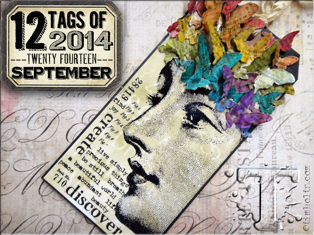
Tim’s tag for September–a note book cover

This is my first effort and because it went totally wrong I guess I’ll be trying another one soon. To see Tim’s tag and all the details as to how he made it pop over to his blog to be amazed. Once you’ve seen the process for the background then you’ll understand what went wrong and what I’ve done to this to salvage it.
P1180386a
This is Tim’s tag.
I used Willow for the first layer and then blending solution and Lettuce through the stencils. Although it isn’t what I set out to achieve I do like the results  and carried on using it to make a cover for a sketch book.
P1180382a
The leaves were given the same treatment as Tim’s butterflies.
P1180391a
Stamps used – Bird Feather, Thankful Silhouettes, Classics #17.
Strip die – Autumn Gatherings
P1180392a

Another great tag from Tim and more techniques to add to our tool box to use.

Thanks for stopping by today, have a great week.

hugs Brenda xxx

Friday, 5 September 2014

With a Flourish for A Vintage Journey

For some reason when looking to start this Creative Guide piece for AVJ I got to thinking what ‘flourish’ means, things like – to thrive, prosper, be at the peak of condition, to make bold, sweeping movements and looking at the interpretations helped me to focus in on what I wanted to show through my project, which is the boldness of the curves in flourish shapes; the similarity in some of the beautiful flourished fonts we use and a beautiful lady at the beginning of her adult life.
P1180353
Our host for the new challenge at A Vintage Journey says - 
‘Have you ever noticed that much of Tim's packaging includes that fabulous flourish? It has always been one of my favourite Tim images, so for this challenge let's see what you can do with your flourishes!  You might not have the "actual" Tim flourish but I am sure we all have a flourish die or stamp in our stash which can get the shabby/vintage treatment’.
So off we go on another route of this Vintage Journey, let’s see where we get to then.
P1180356
Stamp  ( Fabulous Flourishes) in walnut stain over the tag. Using the flourish text from the Merchantile stamp set ink with embossing ink and stamp randomly over the top, cover with clear embossing powder and heat set.
P1180322
When cool ink over tag with chosen colour (I used Victorian Velvet) and edge with brown (I chose Brushed Corduroy).
P1180326P1180328
Add collage elements, the photo is of my grandmother when she was a young lady. Finish with embellishments, including a couple of flourishes from the festive greenery strip die and some ribbon. Can you see there are even flourishes on the strip of patterned paper I added?
P1180357
And there we have it ….

I hope you will join us this fortnight for Jennie’s challenge at A Vintage Journey, you do not have to use Tim Holtz products but tell us what inspired you of his to make the project. My Tim inspiration this time round are the stamps, flourishes from the spring greenery die, ephemera and heart embellishment.

I hope you will join us on this leg of the journey and share a project that has been inspired by Tim in someway. I’m looking forward to seeing what you share.

Have a great weekend and hopefully some time to create and make.

hugs Brenda xxx

Thursday, 4 September 2014

PaperArtsy Mini printer Tray


Hi everyone, I have a guest project over on the PaperArtsy blog tonight.
I used a Tando mini printers tray and had great fun creating a little scrapbooking project which turned out completely different to what I had imagined, but there goes my creative muse with a mind of her own and taking me off in a different direction, but that’s what so exciting about creating your own art isn’t it?
 
Here are some of the photos, but do go across to the PA blog if you have for more details.
 
PHOTO 1 0914PHOTO 3 0914PHOTO 4 0914PHOTO 5 0914PHOTO 7 0914
The photos are of my children, Ben and Maddie when they were much smaller and of my dear Mum and Dad.
 
Thank you to my new Followers for taking the plunge to see what I create, I hope you find some inspiration along the way and thanks for taking the time to stop by today.
hugs Brenda xxx